Vancouver Writers Fest, Breathing new life into a storied arts and culture festival.
What We Did
Marketing & PR: ZG Stories
Web Development: Alan Chao
Illustration: Arty Guava, Genice Chan, Hanna Lee Joshi, Odera Igbokwe, Rachel Wada
For over 35 years The Vancouver Writers Fest has fostered connection between authors and literary enthusiasts through their flagship festival and ongoing year-round programming. With eyes on the future, the organization had lofty goals to grow the festival’s offering into podcasts and new-media, diverse new events, and an evolving core audience – and with this a refreshed identity was needed.
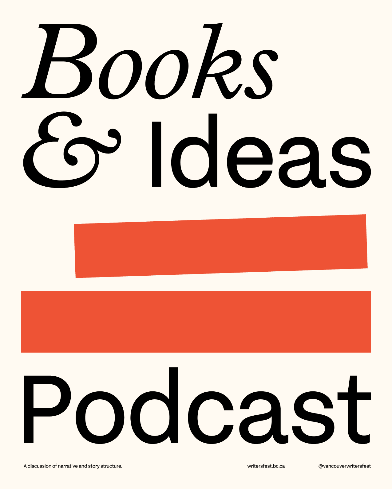
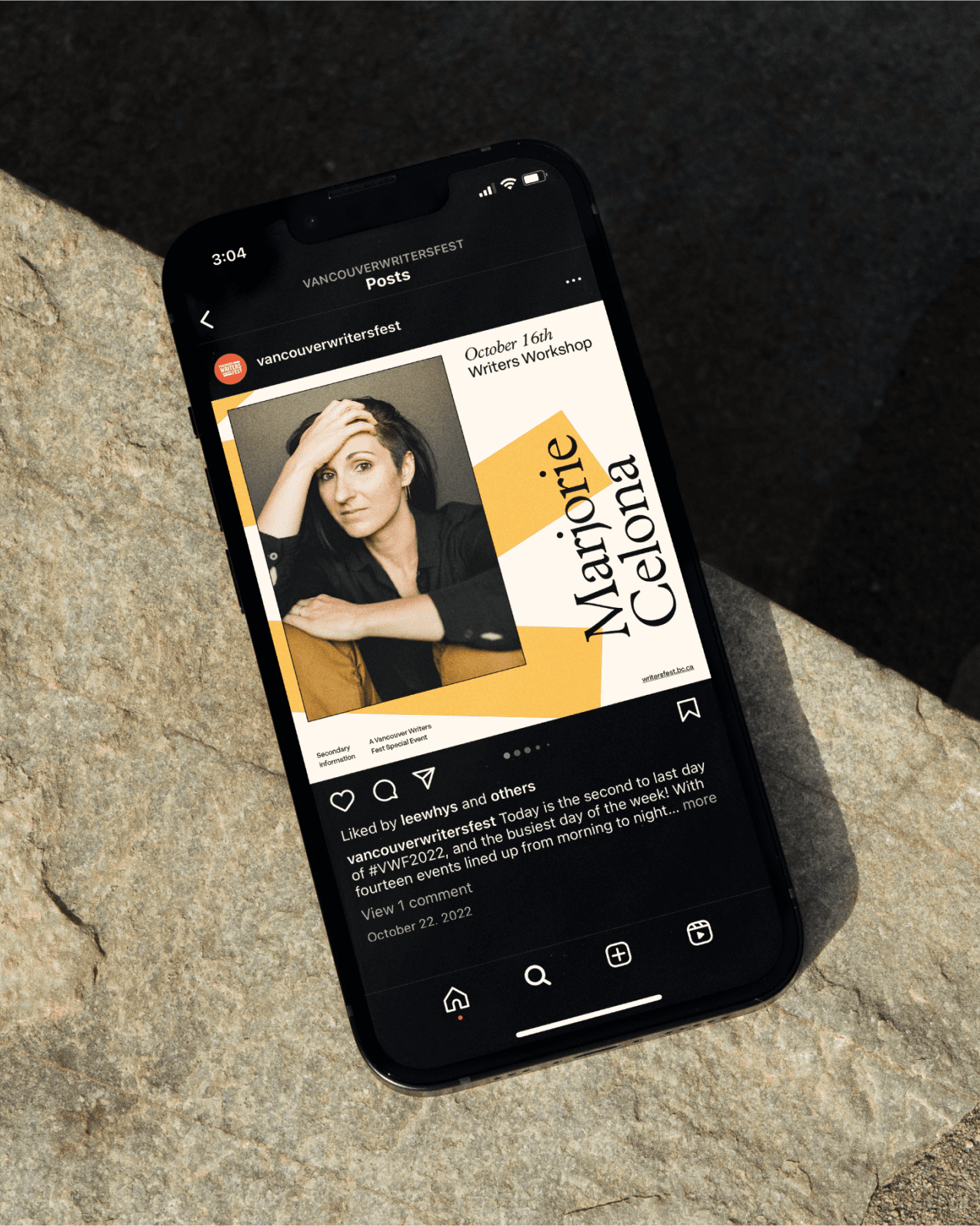
We were approached with the task of elevating and enhancing the festival’s visual presence, while also solving for the complex mix of marketing materials required on a daily basis. What resulted was a lightly refreshed logo which became the basis for an entire graphic system that leaned into literature and a sense of place. A recurring book-stack motif became a core visual asset across their marketing, along with colors inspired by the surroundings of the Writers Fest headquarters on Granville Island.


A Grid Built on Books
A strong, repeatable, and adaptable template system was critical to the success of this new identity. Needing to work across print, digital, and a range of content needs, we devised a ‘brand grid’ that allowed for easy decision making for anyone rolling out new materials.
Using the 2:3 proportions of standard pocketbooks, a 24×24 grid houses content with the ability for type, imagery, and visual elements to snap into place, not needing to adhere to strict type sizes or placement rules when deliverable sizes and content needs are in constant flux.


The Flagship Festival
Layering the brand with new voices through illustration
With a new core identity acting as a foundation for the brand, we engaged several illustrators across Vancouver to bring their unique voice, style, and perspective into the festival’s communication. Using the ‘book stack’ motif as a starting point, illustration could be layered onto the brand identity to create striking and meaningful marketing materials that connected to some of the core ideas and themes explored within the festival’s programming.


