UMYUM Foods, Reimagining what plantbased foods can be.
What We Did
Photography: Lauren Leggatt
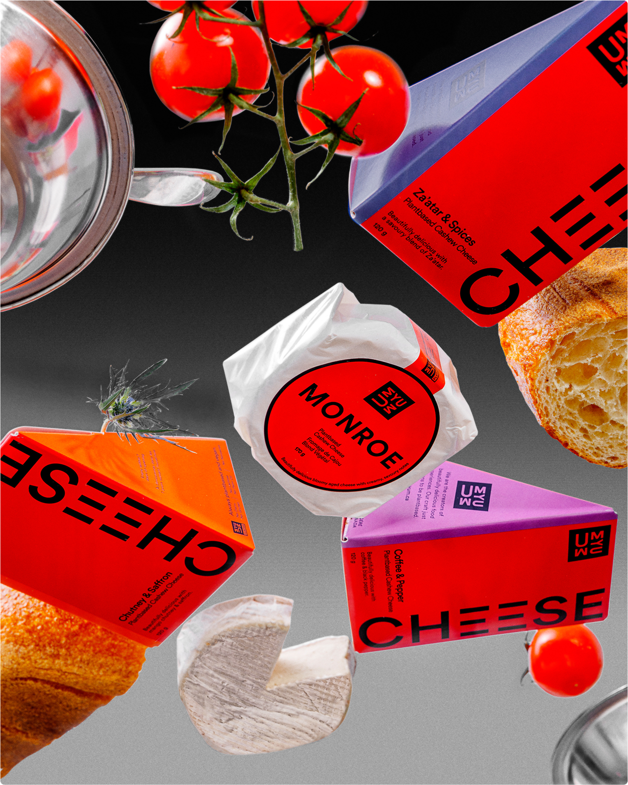
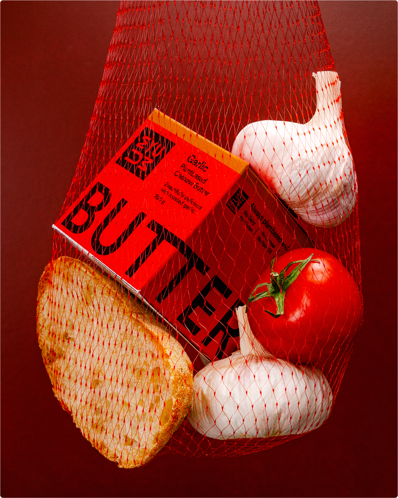
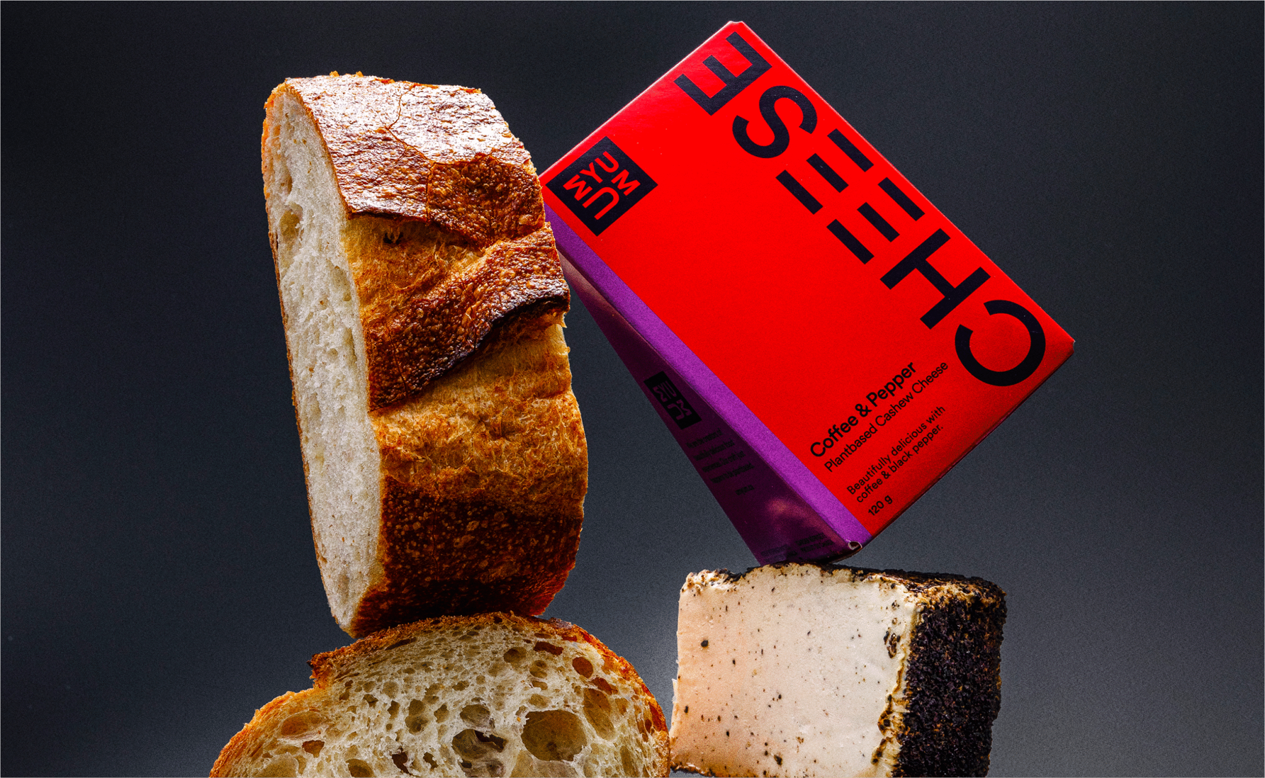
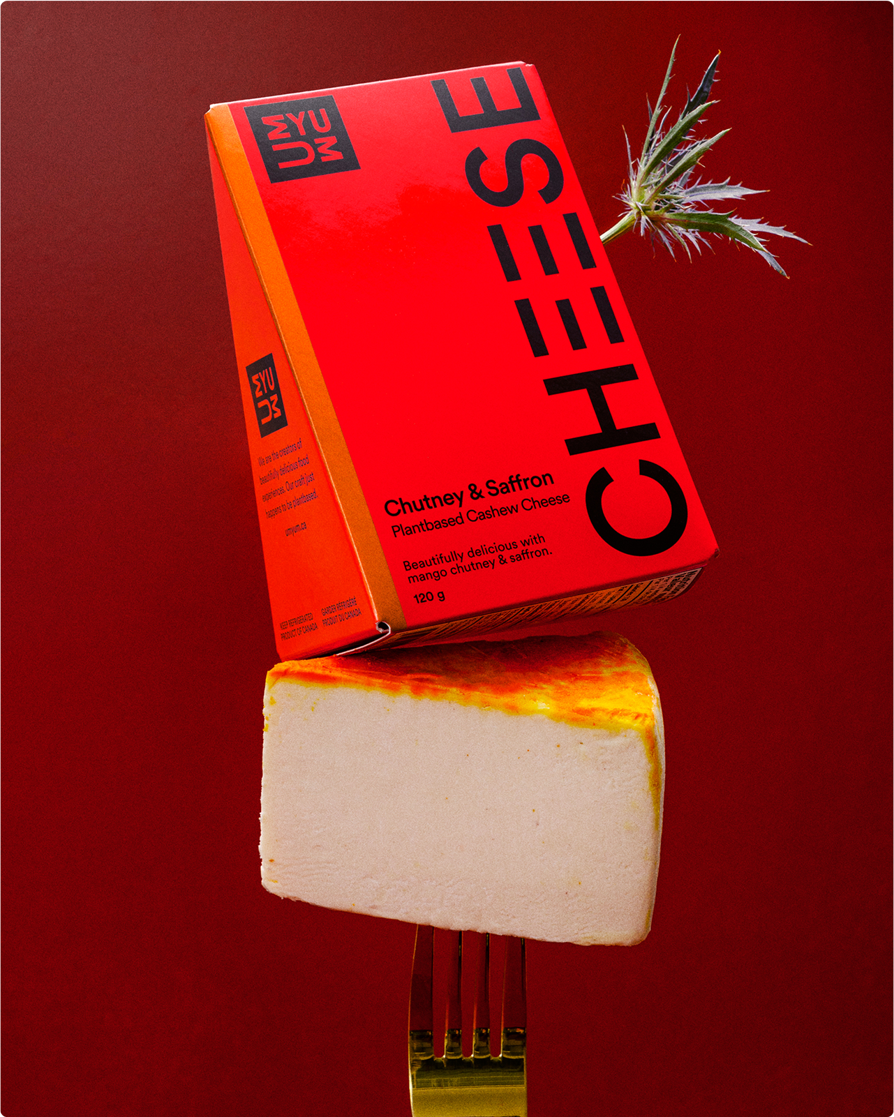
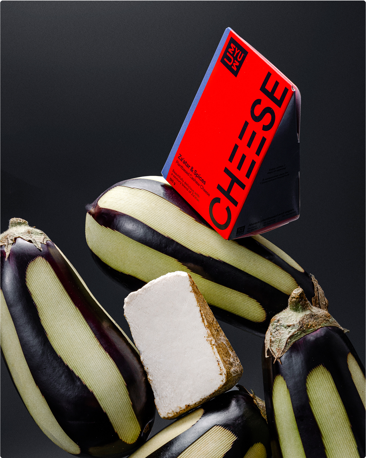
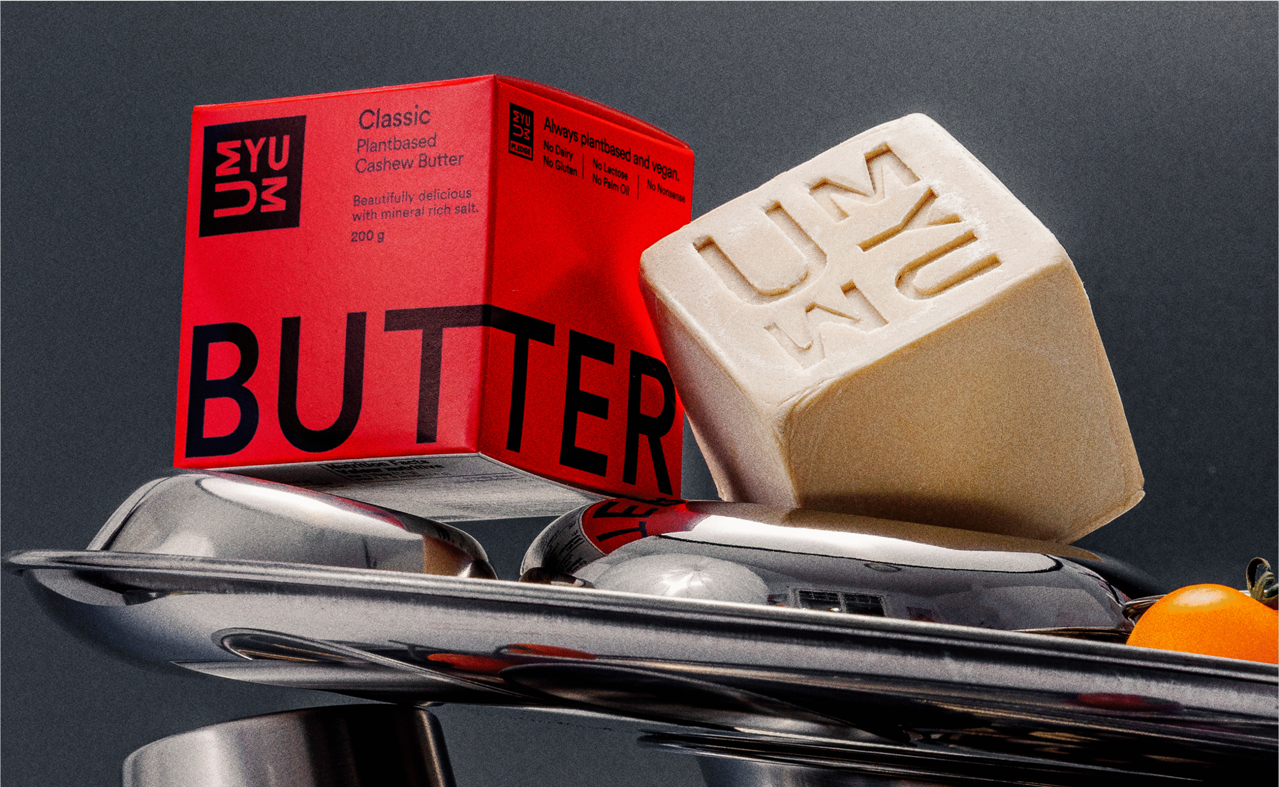
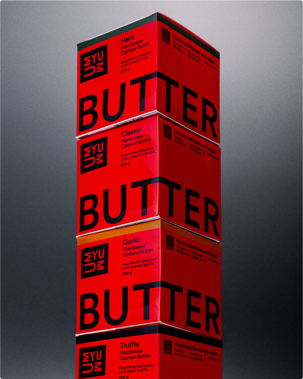
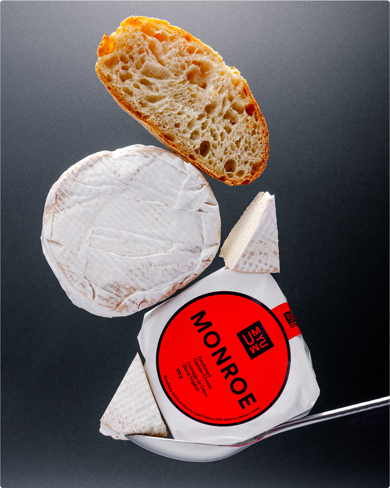
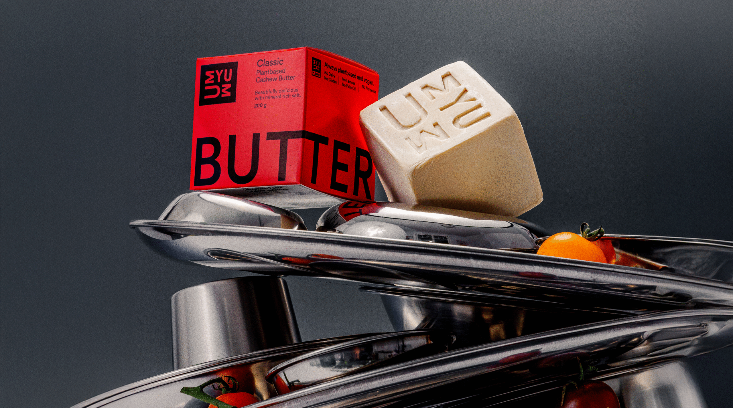
Following our work on UMYUM’s brand identity and original butter packaging, we’ve continued our collaboration with the team to expand the iconic red cube across new SKUs—from soft butter to plant-based camembert—while keeping the bold, playful spirit intact.
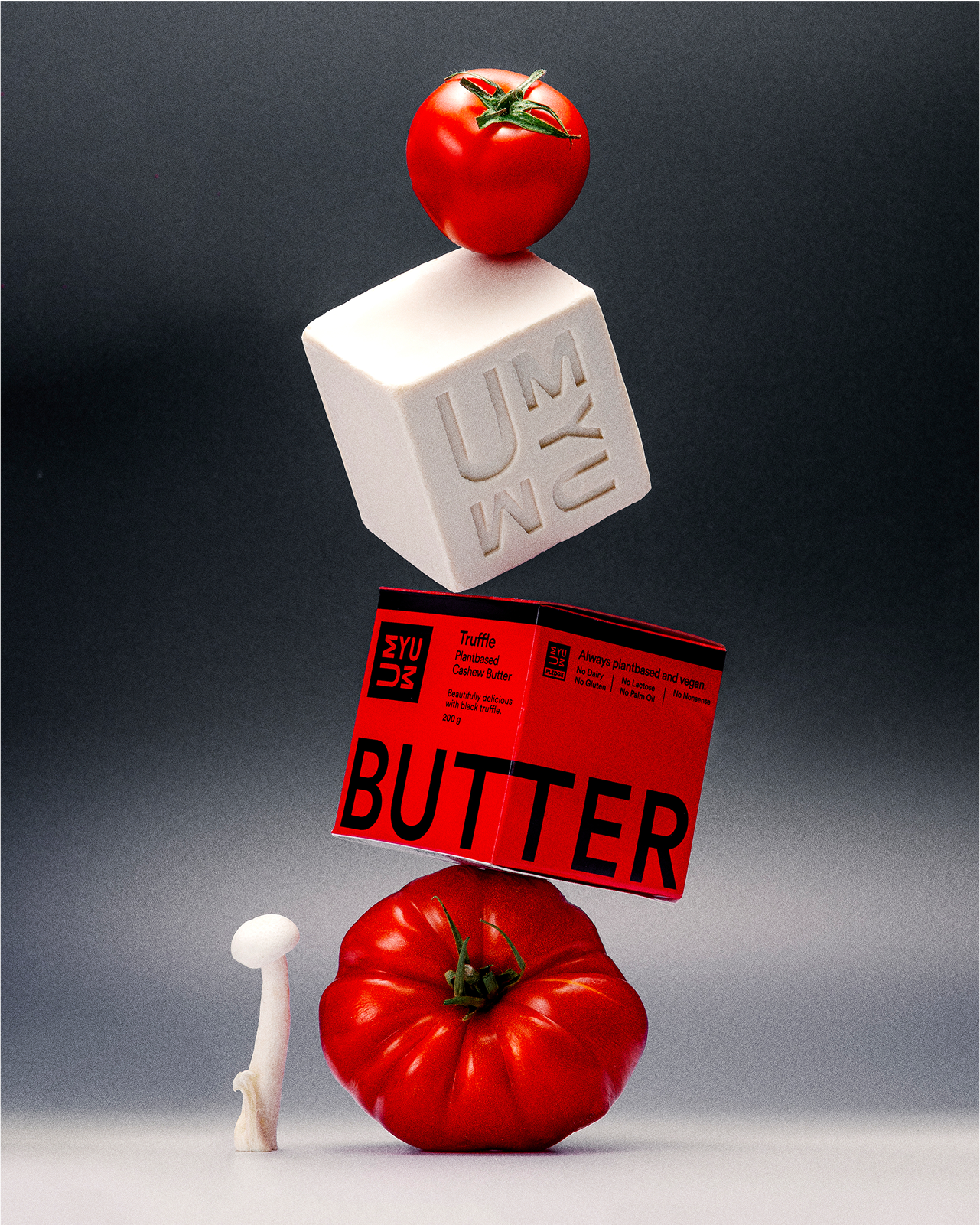
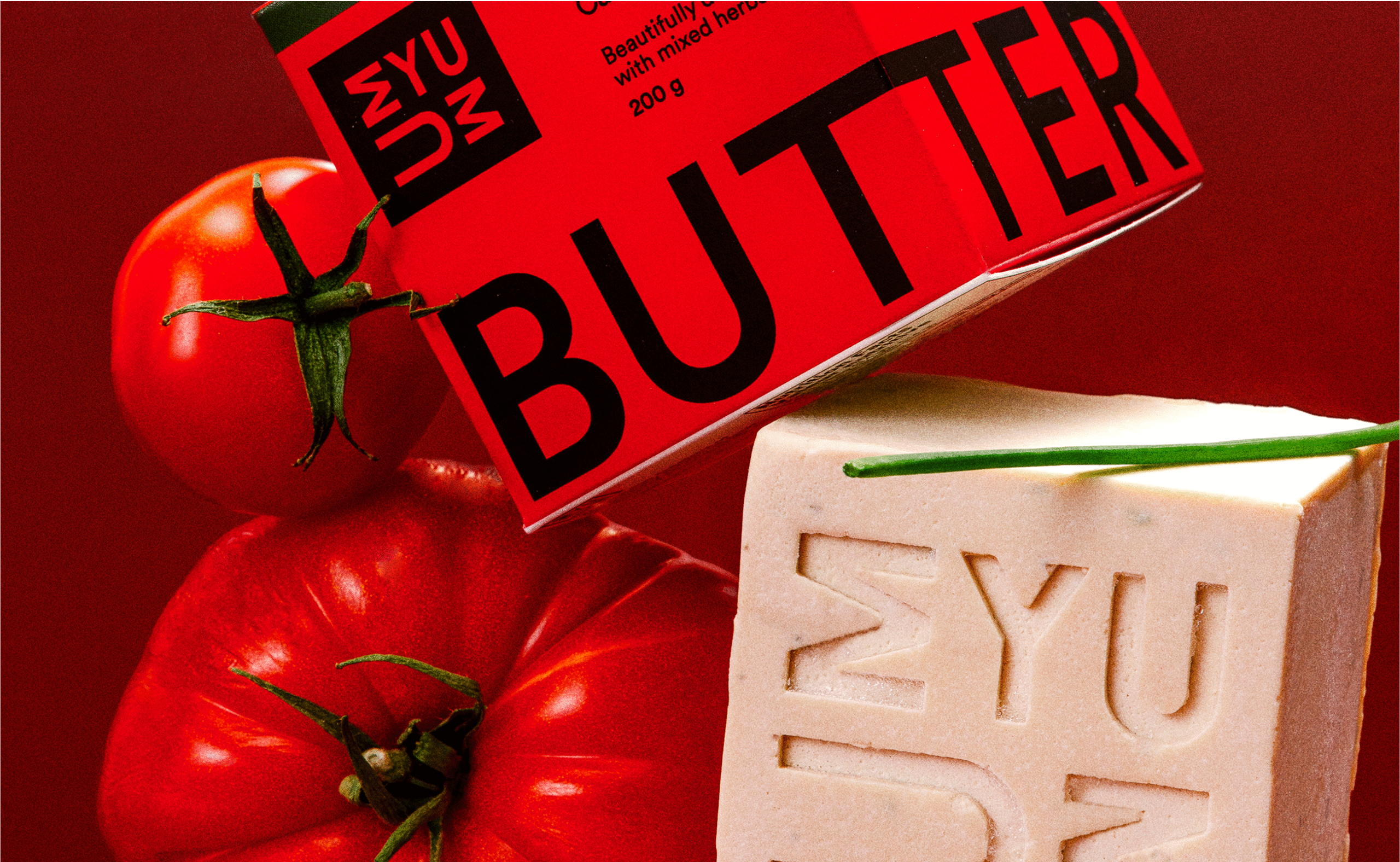
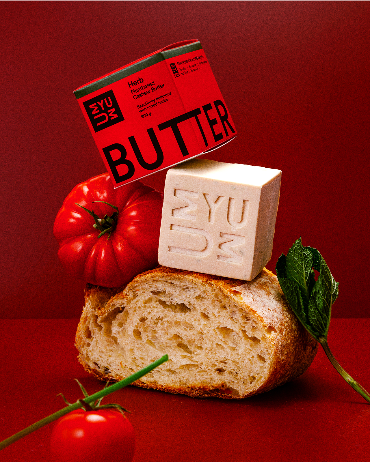
With the line growing, it was also time for a photography refresh. Partnering with Lauren Leggatt, we created a new visual set that positions UMYUM more in line with a luxury product than plantbased foods – elevated, confident, and unmistakably UMYUM. Big type. In-your-face red. Plant-based food that doesn’t whisper from the shelf, it shouts.
