In today’s ever changing world, a brand’s unique identity is essential, and one way to achieve this is through illustration. By conveying messages and personality without words, it’s a valuable tool that we, as a creative agency in Vancouver, like to incorporate into our work. As we keep a close eye on the creative talent in the city, we’re thrilled to see the growing community of talented illustrators. From realistic and painterly styles to whimsical and intriguing designs, we’re excited to showcase 5 of our favourite illustrators in Vancouver.
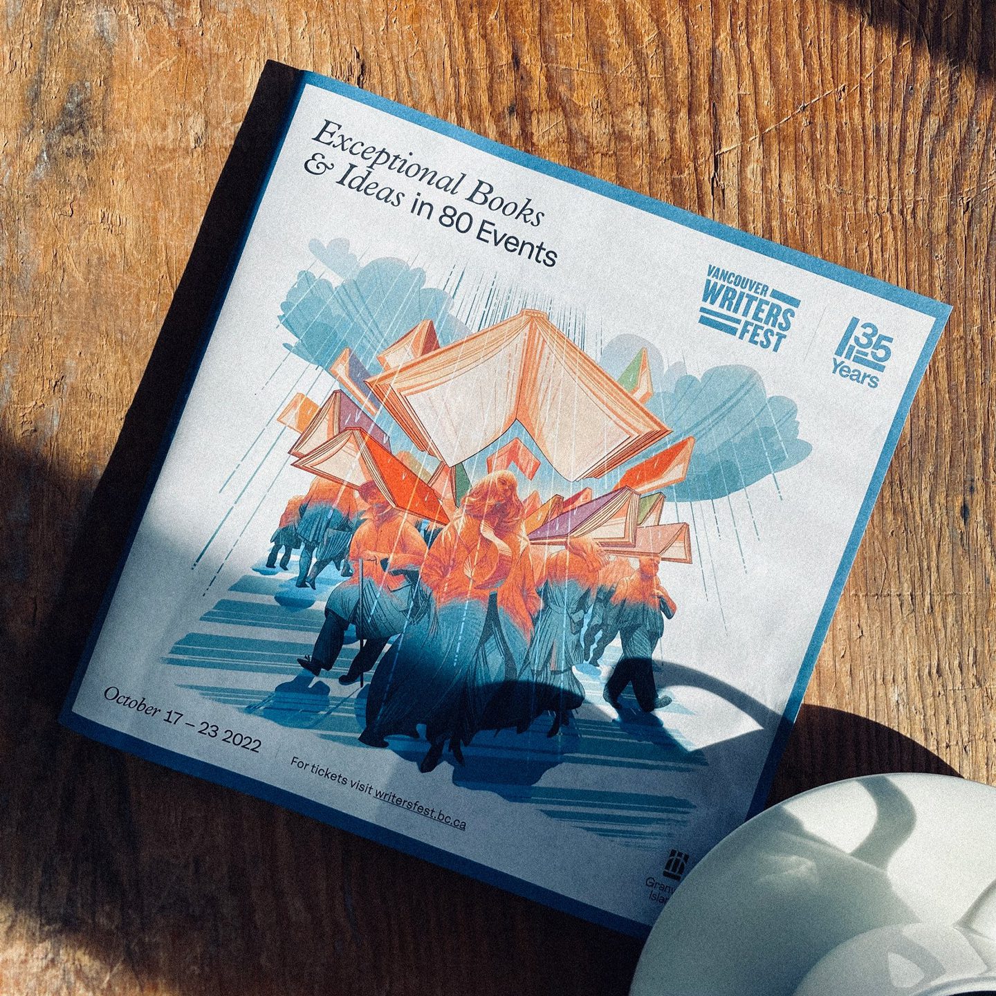
Genice Chan
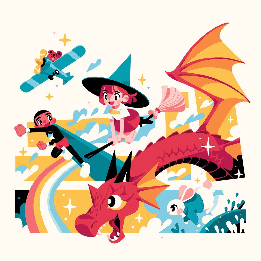
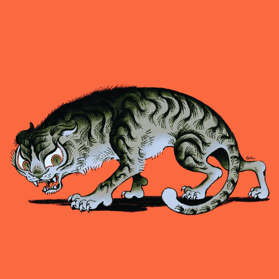
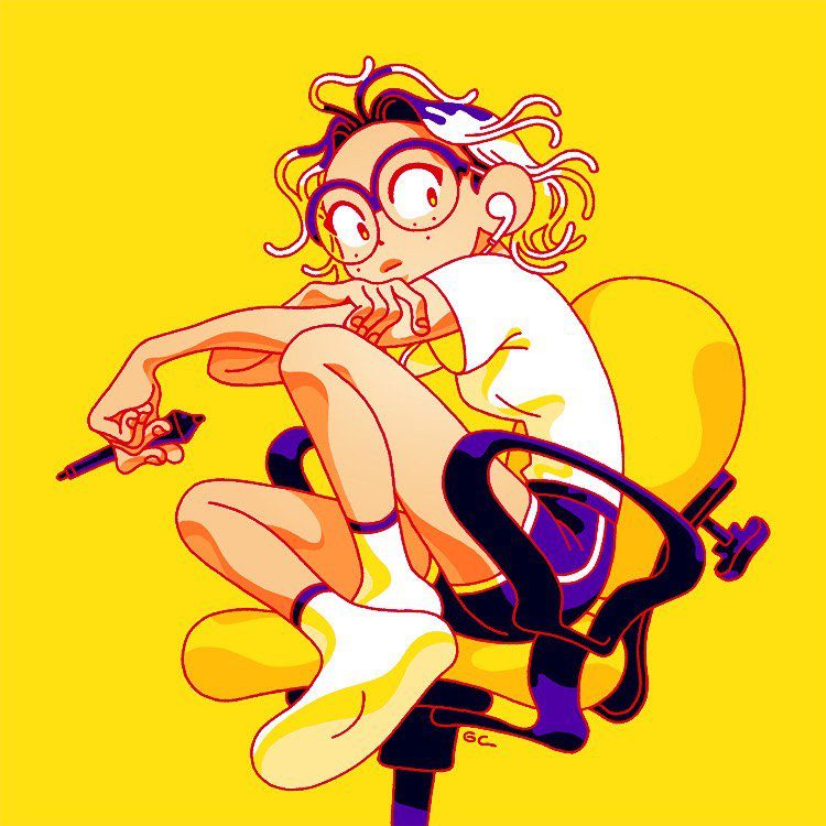
Genice Chan is an illustrator whose work exudes a cartoony, anime influenced vibe. She’s worked on some amazing projects, ranging from Twitch videos for Pokimane at Giant Ant to the 2021 Vancouver Writers fest with us!
Her use of colour is always so good, and her strong visual development skills are evident in her strong compositions and use of space within her work.
Website / Instagram
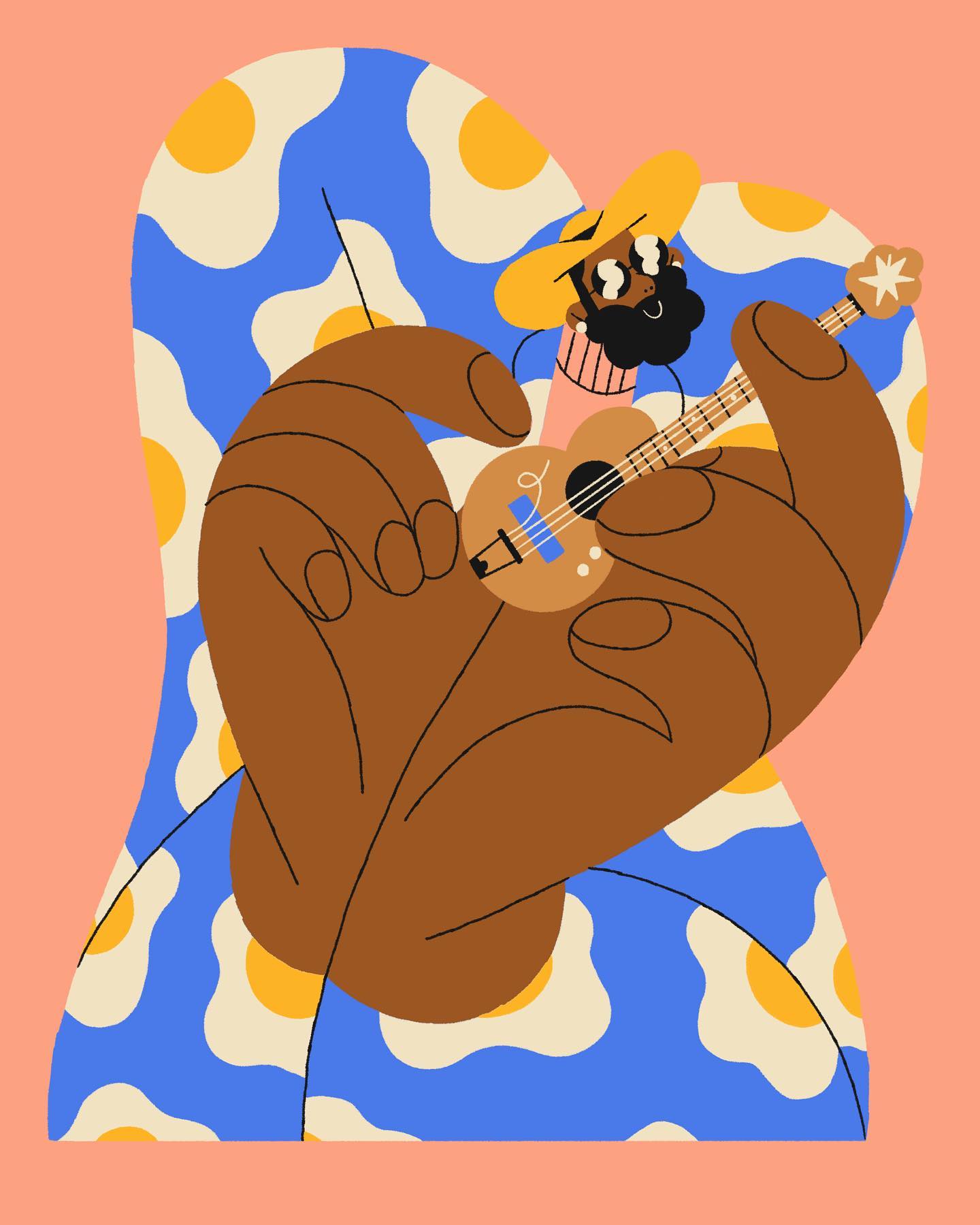
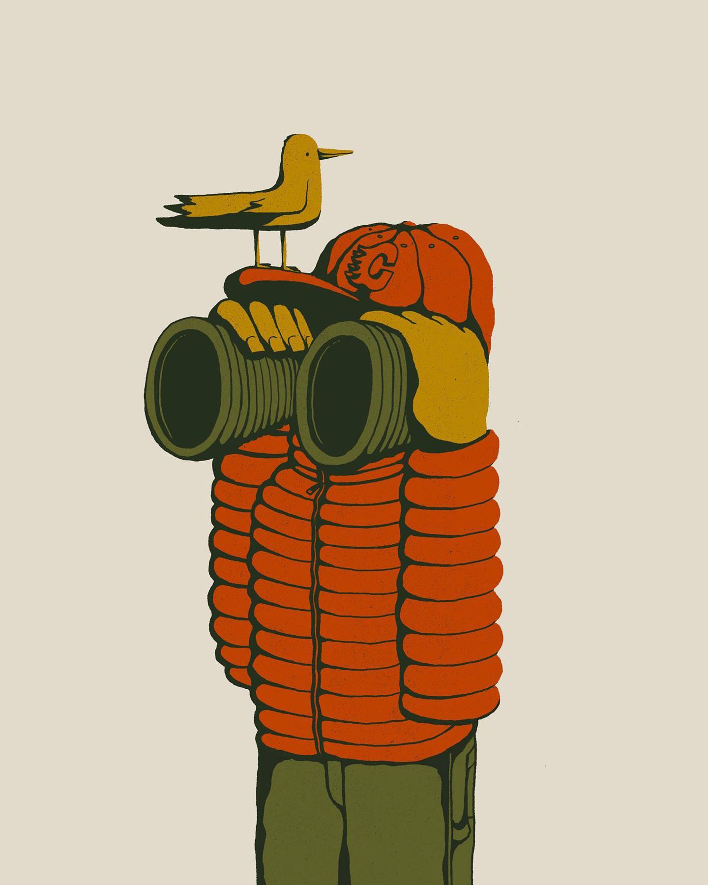
Rafael Mayani
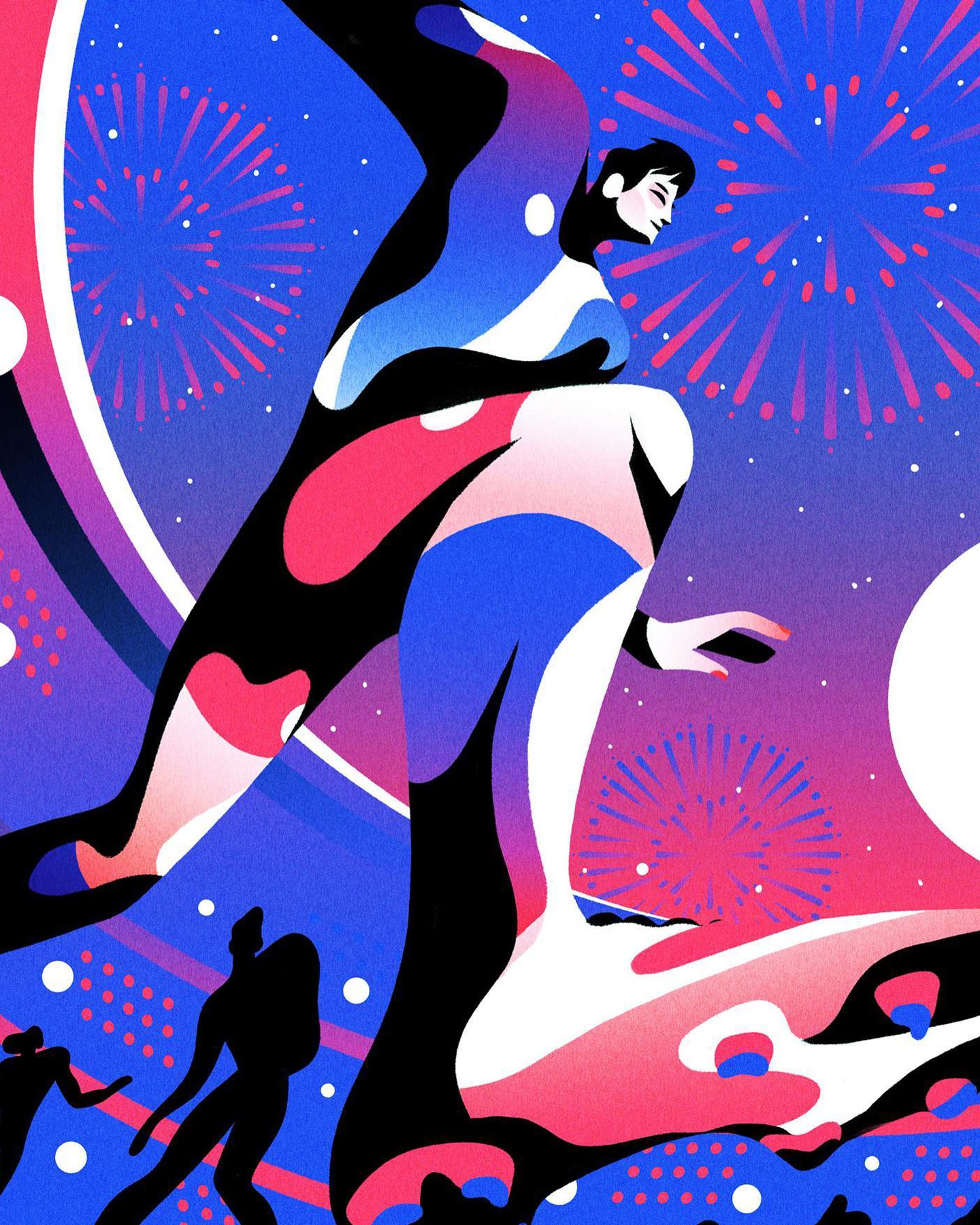
Rafael Mayani is an amazing illustrator, as well as associate creative director at Giant Ant, one of the premiere animation houses out there.
Rafael’s style is characterized by vibrant colors, bold lines, and a strong sense of movement and dynamism. His work often features a strong use of perspective, stylized human forms, and scale which is iconic to his style. He has a keen eye for detail and a unique ability to convey emotion and personality through all the work he does.
Website / Instagram
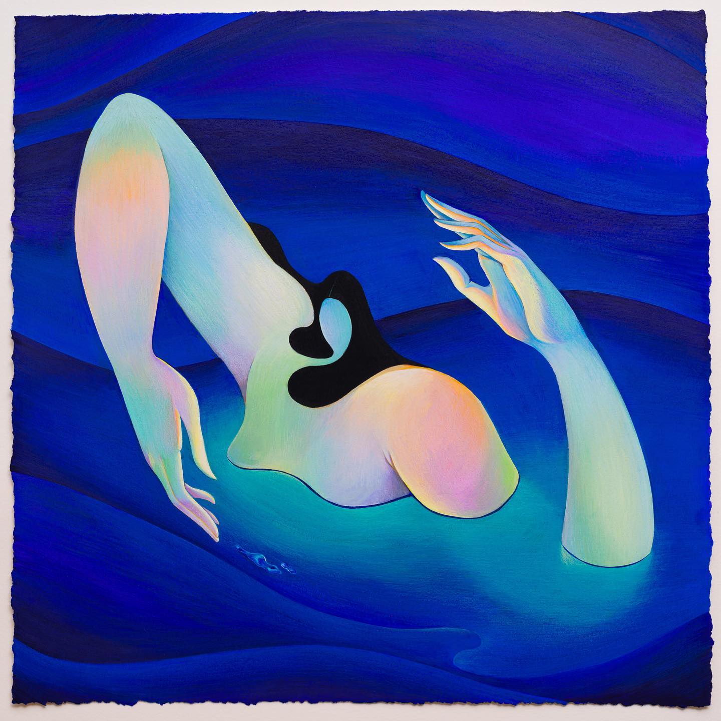
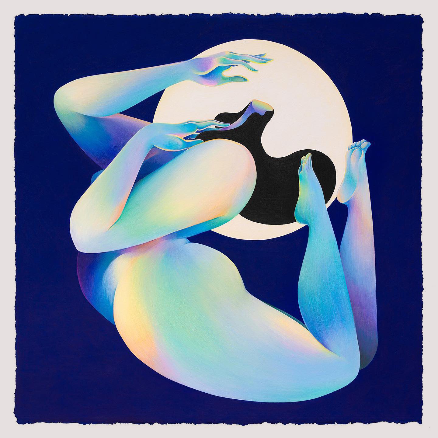
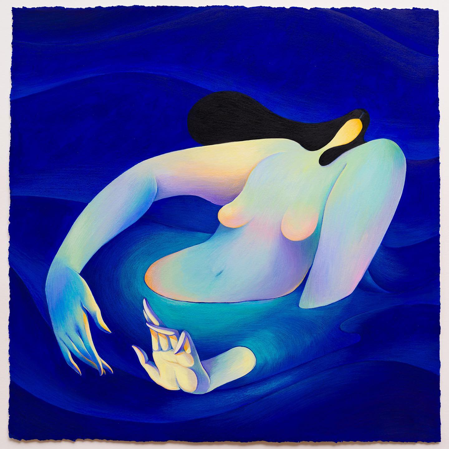
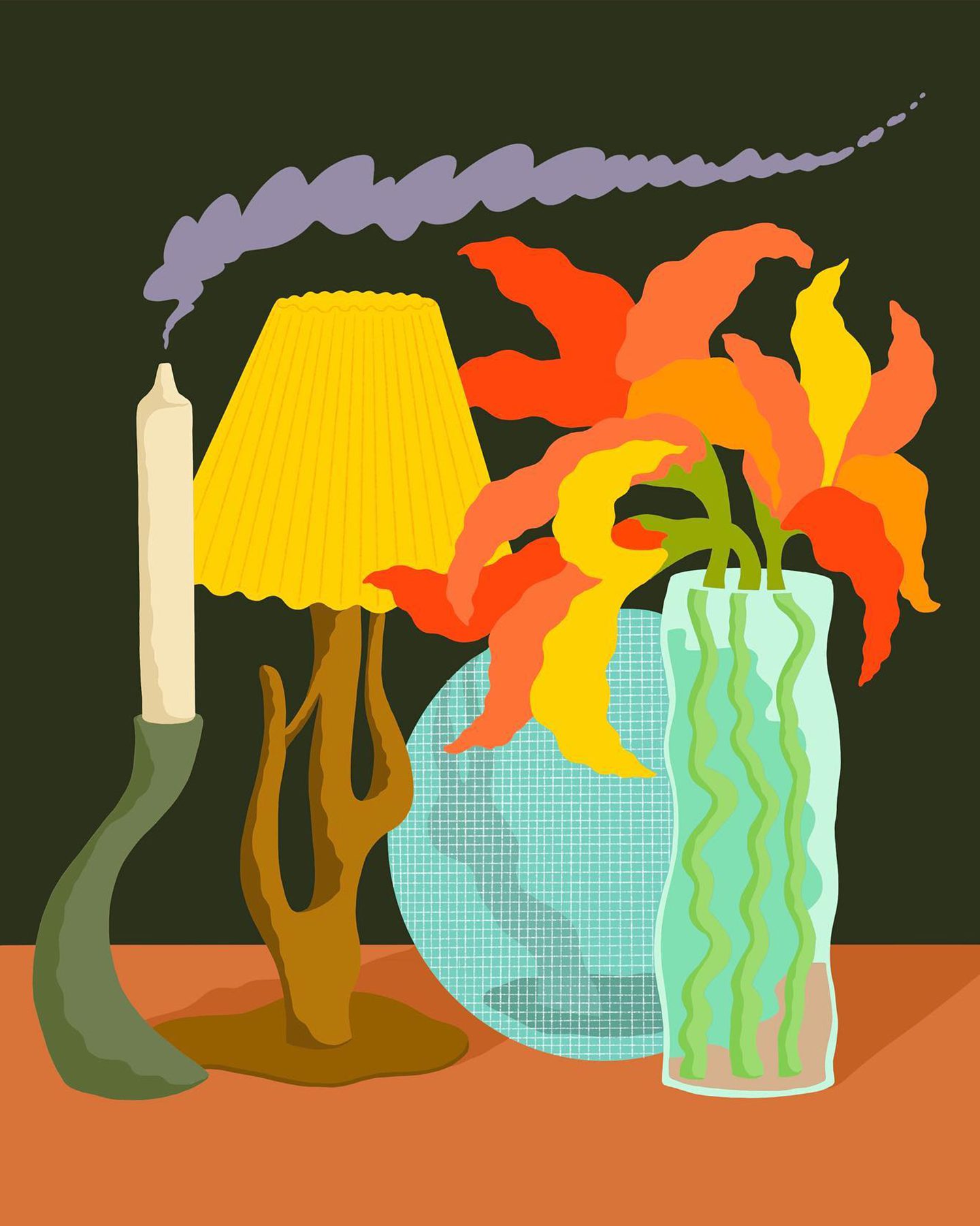
Hanna Lee Joshi
Hanna Lee Joshi is a Korean-Canadian artist from Vancouver, who we’ve had the pleasure of collaborating with for the 2021 Vancouver Writers Fest campaign.
Her work features the use of organic, flowing shapes and gradients which results in a beautiful, whimsical feeling. The female form is usually present within her work, which often explores themes of identity and individuality. Hanna Lee Joshi is one of our absolute favourites in the city, and we’re sure you can see why.
Website / Instagram
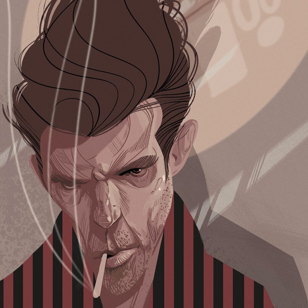
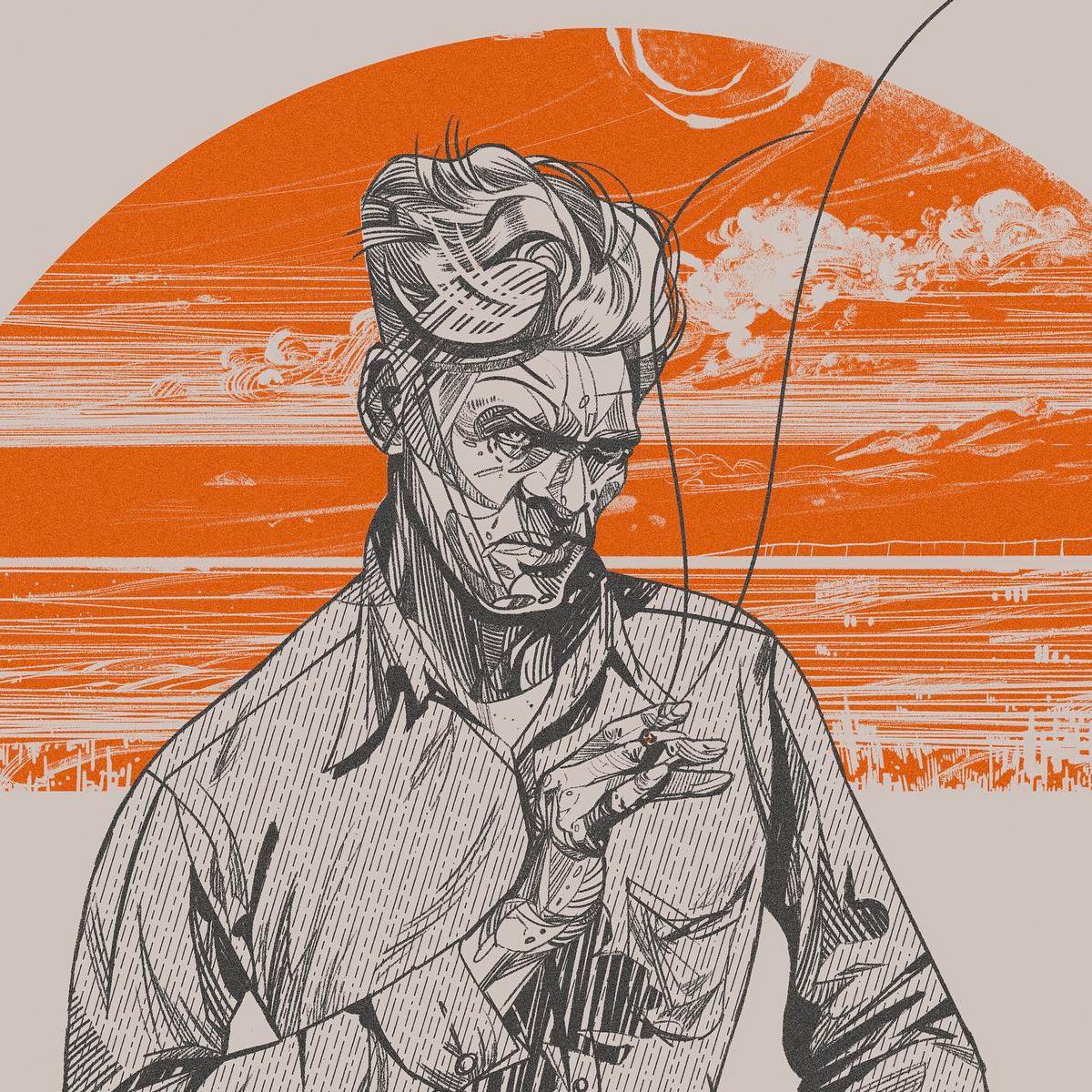
Benjamin T. Stone
Benjamin T. Stone is a designer and illustrator based in Vancouver, who collaborated with us on the 2022 Vancouver Writers Fest campaign.
His illustrations are highly editorial, using more muted, natural tones and often depicting humans in emotive ways. His range is spectacular, and the ability to tell a full story through smaller nuances in his work is something we really admire.
Website / Instagram
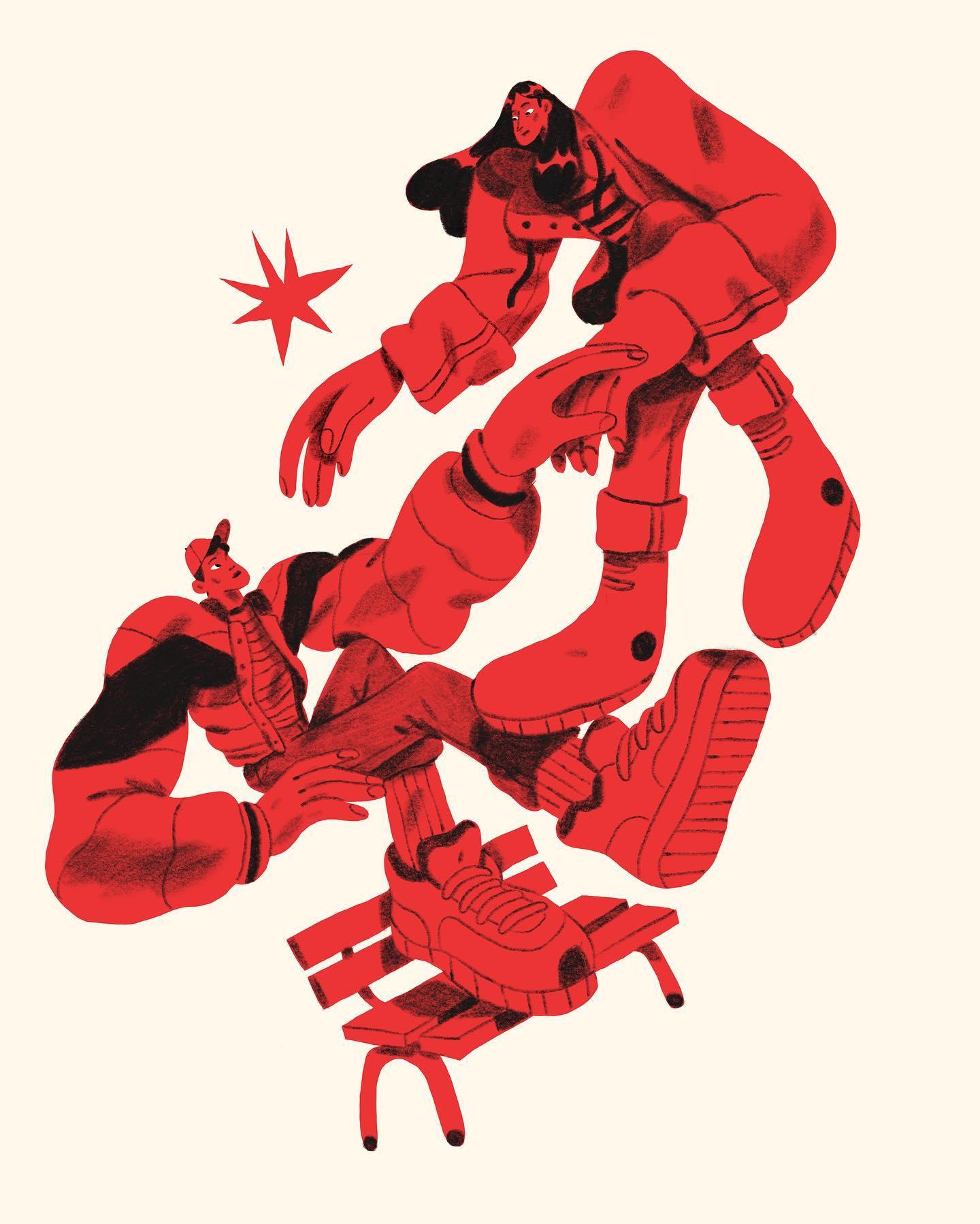
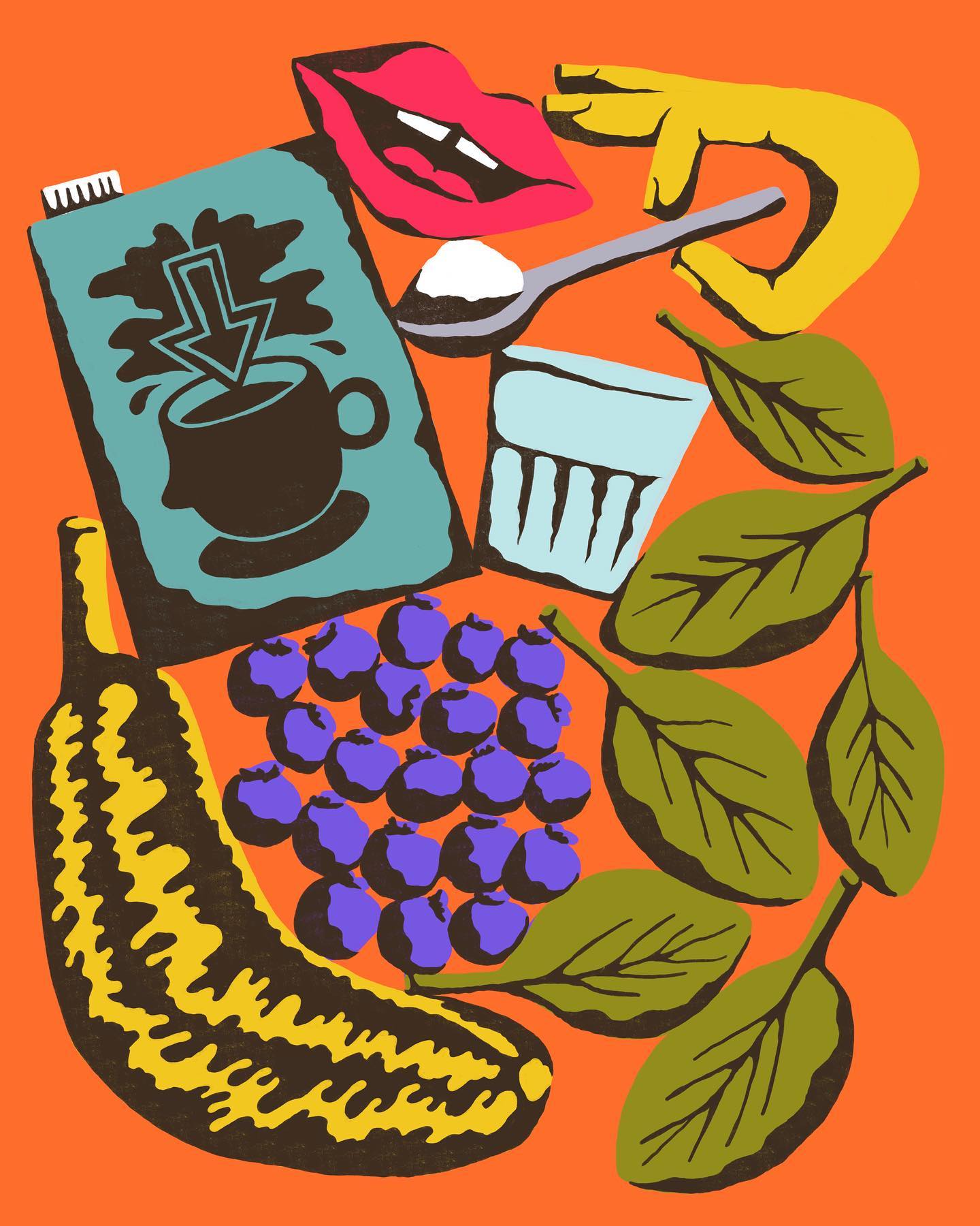
Spencer Pidgeon
Spencer Pidgeon is a designer and illustrator who’s work bleeds personality and character. Colourful and with a hand-drawn feeling, Spencer’s work communicates through humour and play.
The fact that he’s also a designer is evident in the way he presents his illustrations, as well as the way he integrates illustration into his work. One to watch for sure, we’d love to work with Spencer one of these days.
Website / Instagram
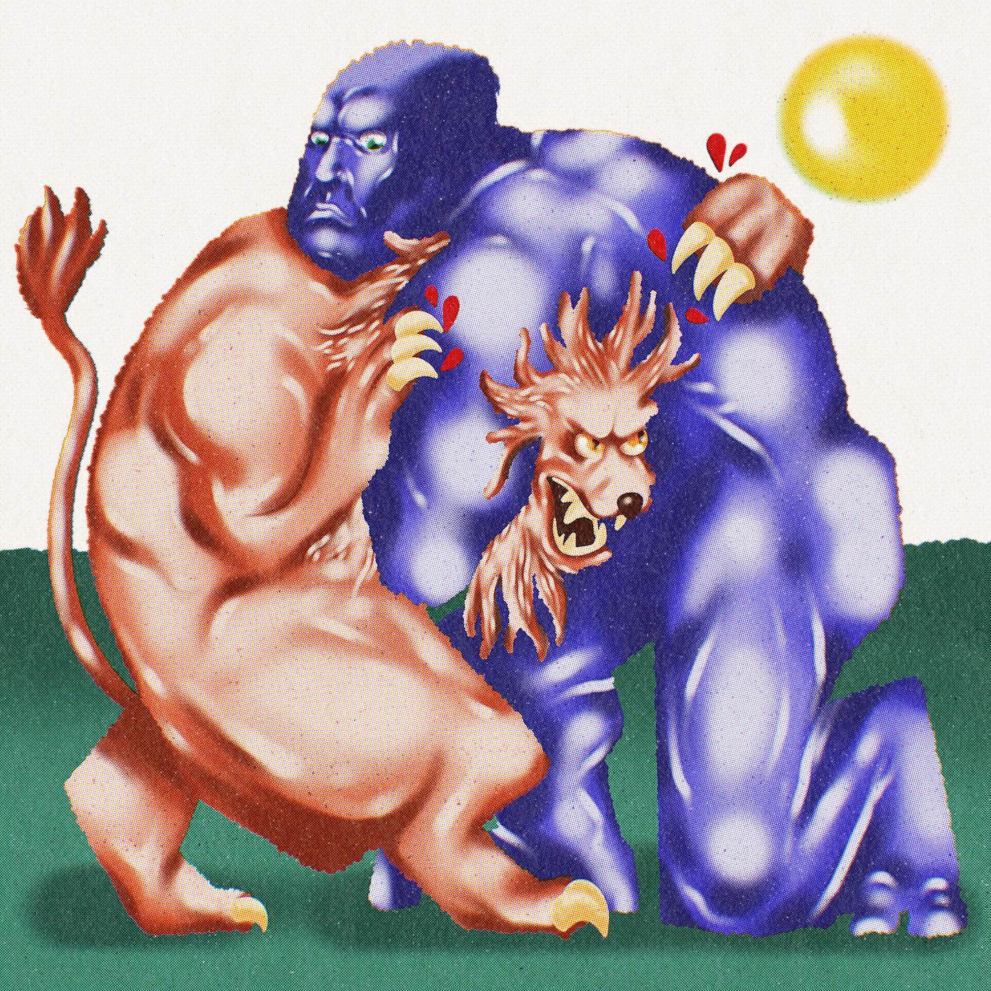
Arvin Paelmo
Ok ok, this one is a bit of a gimme but real recognizes real. Arvin, one of the co-founders here at ZAK and operating art director is an extremely talented illustrator. He can cover a range of styles, has an inherently artistic eye, and drives a lot of the illustrated work we do here.
Instagram
We’re very excited to share some of the brand identity work we’ve been doing at ZAK with the lovely folks over at DeeBee’s Organics over the last few months!
Led by Michelle Leggatt, we worked closely with the internal team at DeeBee’s to understand who they are, and how their brand needs to serve them for the future.
The design strategy came down to the core idea of ‘celebrating a colorful world’ – encapsulating everything from treats made with real fruit, diversity, and the magic of treats.
With that in mind, we overhauled their brand across visual identity, illustrations, packaging, and everything in between. Grateful to the whole team at DeeBee’s for their constant collaboration and joy throughout the process!
You can dig in to find more about the project via our case study.
This is a bit of a funny one, and it’s VERY niche but we were posted on Hubspot’s blog about their favourite green websites. As you probably know, we leaned into the green for our brand launch so we’re happy some people are taking notice!
You can get your daily dose of green by reading the article here.
We’ve been featured on Pentawards blog for our work with Nora’s Non-Dairy! Pentawards is an annual packaging design competition and hub, specifically for packaging designers. Nice to see they caught onto the great work we’ve done for Nora’s. congratulatory? Sure, but we know how good it is.
Read their post here!
Happy Friday! It’s always nice to wake up and see our work getting a little love, this time over on the Dieline. Our work for Nora’s Plant Based Ice Cream has previously been featured on the Dieline, so it’s cool to see it up there again.
We recently worked with Nora’s to update their packaging design from what we had done in 2018. A few regulatory things had changed, as well as the desire for the actual ice cream to be shown on the tub. All in all, it was nice to rework the packaging design to be even more scalable than what previously existed.
Check out the post here!
It’s always exciting to wake up and have friends reaching out that they’ve seen your work somewhere in the wild. With the launch of our new website design, it seems we were picked up by the essential Chrome plugin Muzli, by Invision as well as Japanese website design inspiration site 1guu.
Let us know if you spot us anywhere else!
With the launch of our new website, we were super excited to get out there and submit to some of our favourite inspiration resources. Awwwards is one of the most well known, and we were honoured to be accepted as a nominee. The votes are looking good and fingers are crossed we can get featured as a potential site of the day!
If you haven’t had a chance to vote, we’d appreciate any love thrown our way. You can check out the website featured on awwwards here.
If you’re attending Expo West 2023 in Anaheim on March 10th, keep an eye out for Kristian Hay, the co-founder and creative director of ZAK. Kristian will be scouring the exhibition floors, staying up-to-date with the latest trends in brand identity and packaging, as well as checking out the work we’ve done for DeeBee’s Organics. He’ll also be mingling with vendors throughout the day
Kristian will be proudly representing ZAK with our “design department” signature tee. So, if you spot him, don’t be shy to tap him on the shoulder and say hello! We’d love to connect with you. See you there!
If you’re reading this, you’ve probably seen the new ZAK brand out in the wild. Hopefully you like it, and can appreciate how difficult it is to reshape and and rebrand your own business. After 5 years at ZAK, it was time. We’ve been living with a brand identity that was created off the side of our desks a little over 5 years ago (sorry former employers), when ZAK was just an inkling of an idea.
A lot of time has passed, a lot of things have happened, and it was time to launch into the next 5 years of ZAK (and beyond).

While we grew to love our scrappy brand identity, we knew it didn’t really represent who we were anymore. Back then we were just a bunch of kids who wanted to make cool stuff together. We had a lot to learn, and were literally figuring out how to run a studio on a day by day basis.
Today, we’re a creative agency who works with clients both big and small, local and international. Coming out of the pandemic, we had time to reflect on our own brand and it quickly became clear that it was time for a change. We knew it was important that ZAK looks as good as the work that we’re creating.
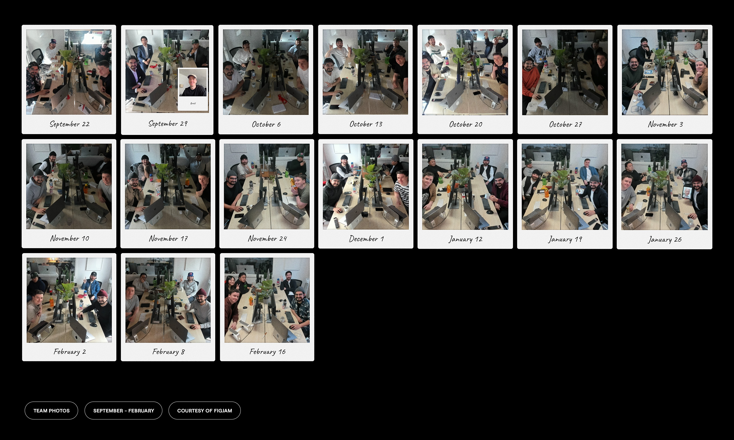
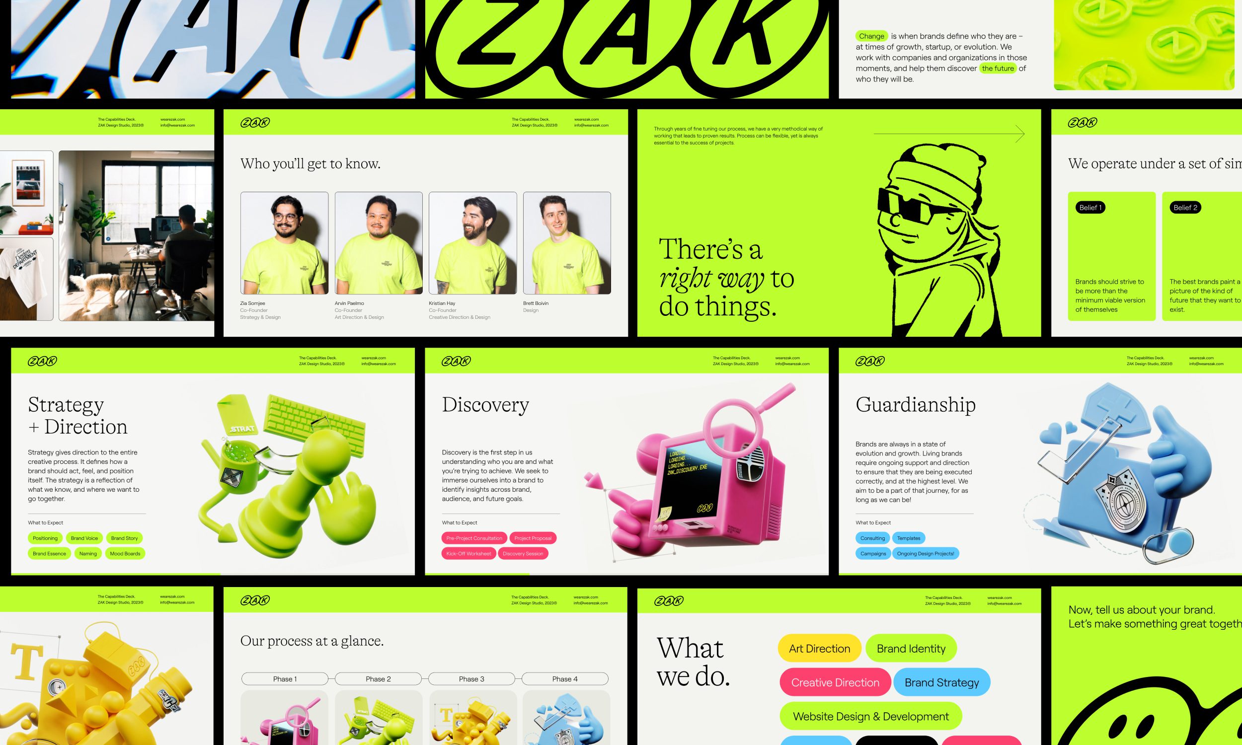
Over the last 6 months or so, we challenged ourselves to work on our own brand the same way we work on any other client project. We carved out a weekly standing meeting, went through discovery and exploration, and explored a whole swath of ideas for the visual identity.
Why We Did It
To put it plainly, we’ve grown up. Over the past 5 years we’ve discovered more about who we are as a company, how we like to work, and who we like to work with. Those 3 things are extremely important to us, and it was vital that we be able to tell that story through the way we talk, but also through our visual language.
We blended a variety of different mediums to build out our brand’s visual identity, ranging from custom 3D assets to simple hand-drawn illustrations. Everyone at ZAK brings a bunch of different skills to the table, and that’s a big part of what makes us unique. Being able to utilize those skills at the core of the new identity allowed us to imbue a bit of each team member into the DNA of the brand itself.
The ZAK 2.0 Brand
On top of that, as a team we definitely lean into being a colorful, personality driven group. We’ve shifted from a black and white brand identity to one that embraces color often.
For typography, we’re primarily using Roobert by the wonderful Displaay type foundry. It’s a mono-linear geometrical sans-serif, with moments of interest on certain letterforms, such as the “g” and “r”. We love how flexible Roobert is, whether being used for headlines or body copy, it’s just right for us.
We’re using GT Alpina by Grilli Type for headline and special cases. From Grilli Type, “GT Alpina proudly calls itself a workhorse serif, but delights in playing with the very meaning of that concept. It reaches into the grab bag of typographic history to resurrect shapes some may falsely see as too expressive, resulting in a meticulous family melding these distinct shapes with a pragmatic execution.”
Our visual identity is a reflection of who we are. A tight knit team of designers, creatives, and friends that work together to help brands define who they are, at whatever moment of change they may be in.
We’re strapped in and ready for the next 5 years of life at ZAK. Take some time to look through our site, read more about us, view some of our new work, and don’t be afraid to reach out if you think we’d make a great collaborator with your team.
It’s always an honour for a team member to be asked to judge anything, no less something we’re all very familiar with – the Applied Arts Student Awards. Back in university, it was always a goal to create a project worth of being submitted to the AA awards. We’re happy to say Arvin Paelmo, co-founder & art director, was selected to be one of the judges for the 2023 edition.
Check out the awards here – we’re stoked to see what the latest bright minds have been cooking up.