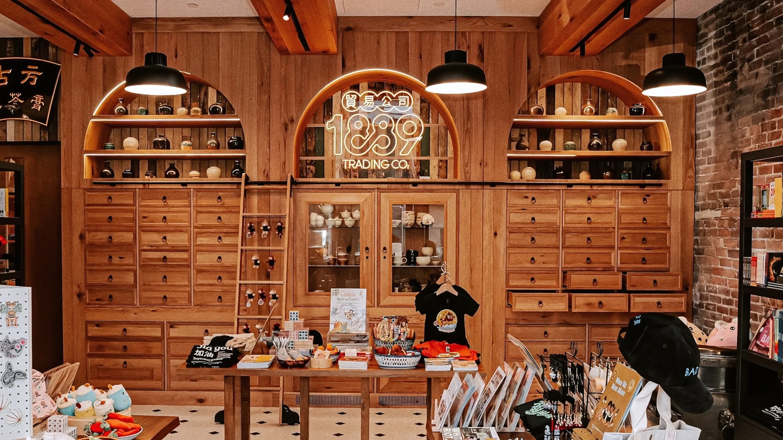
1889 Trading Co., Elevating cultural storytelling through strategic retail design.
What We Did
Interior Design: Cutler
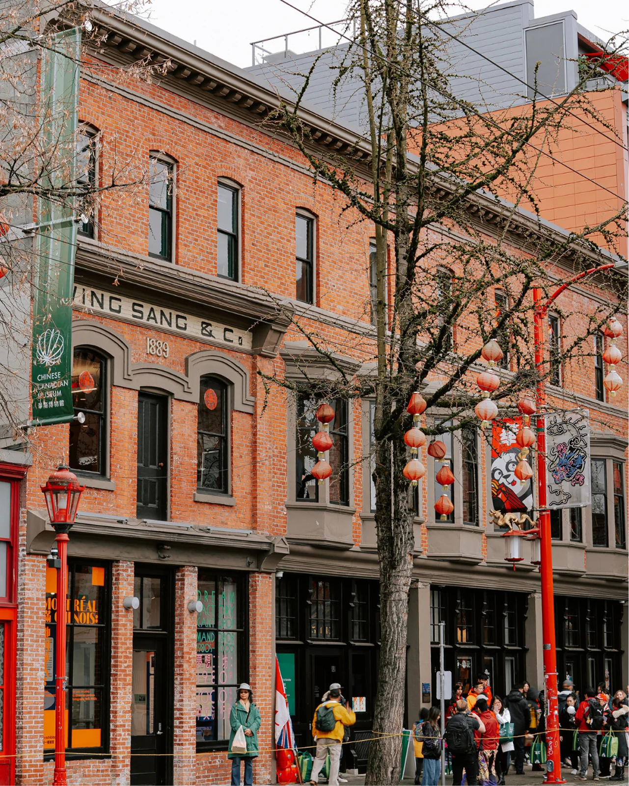
The Chinese Canadian Museum came to us with a meaningful challenge: they were opening a contemporary gift shop inside the historic Wing Sang building at 51 E. Pender Street, the oldest standing building in Vancouver’s Chinatown. It couldn’t just sell things. It needed to honour a story that has been unfolding for more than 130 years.
The ask wasn’t just design. It was naming, positioning, voice, and a complete visual identity system — one that could feel welcoming across generations while staying deeply rooted in the culture and history of Chinatown.
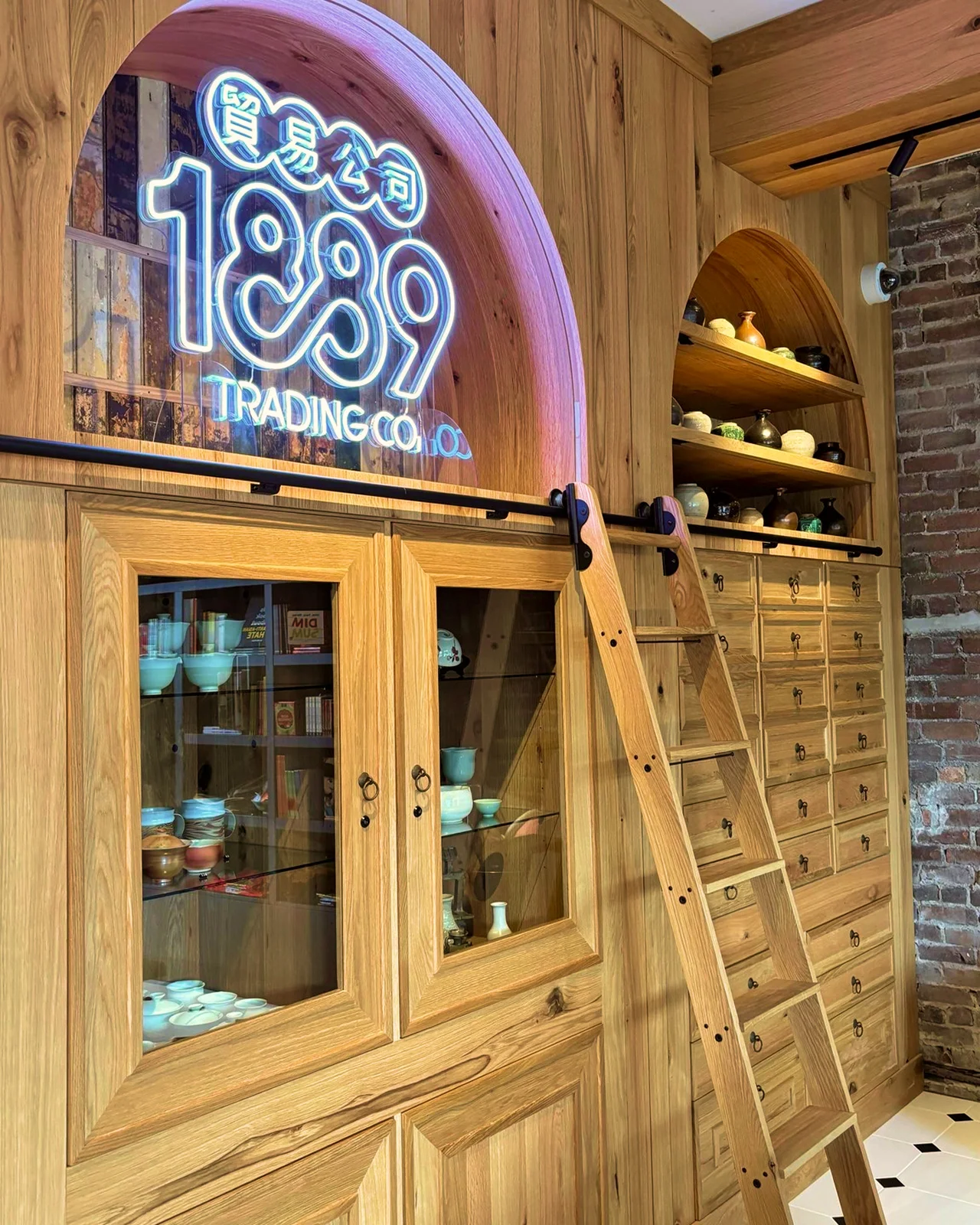
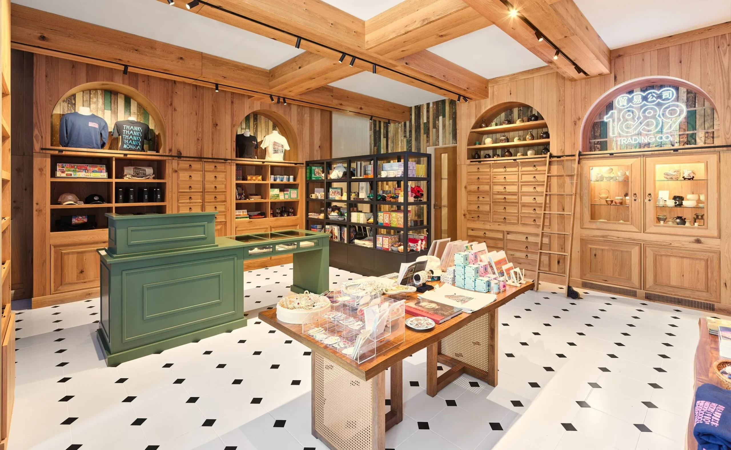
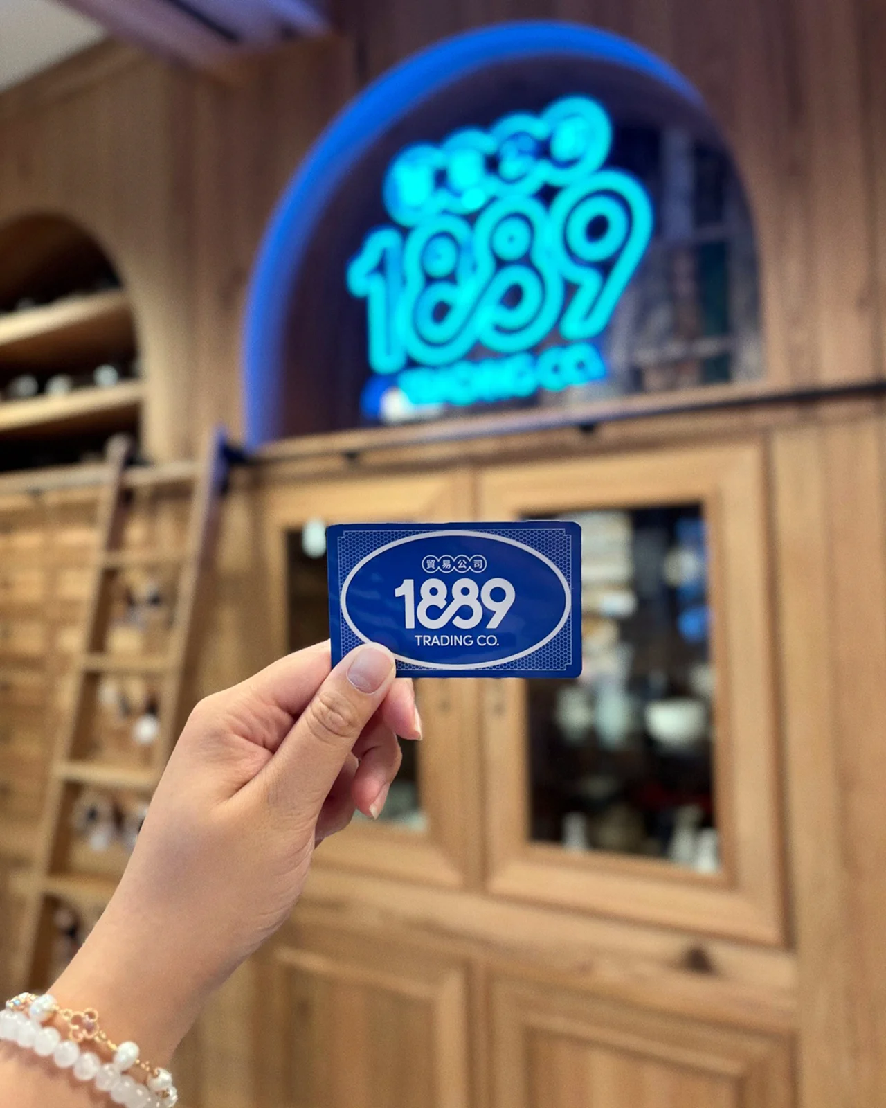
We named it 1889 Trading Co., after the year Yip Sang acquired the Wing Sang building and established the original Wing Sang Company, a trading house that connected communities across continents.
From this address, Yip Sang ran a business that was about more than goods. It was a place of exchange, opportunity, support, and culture.
The name positions the gift shop as a continuation of that spirit. A modern trading house rooted in the history of the building itself.

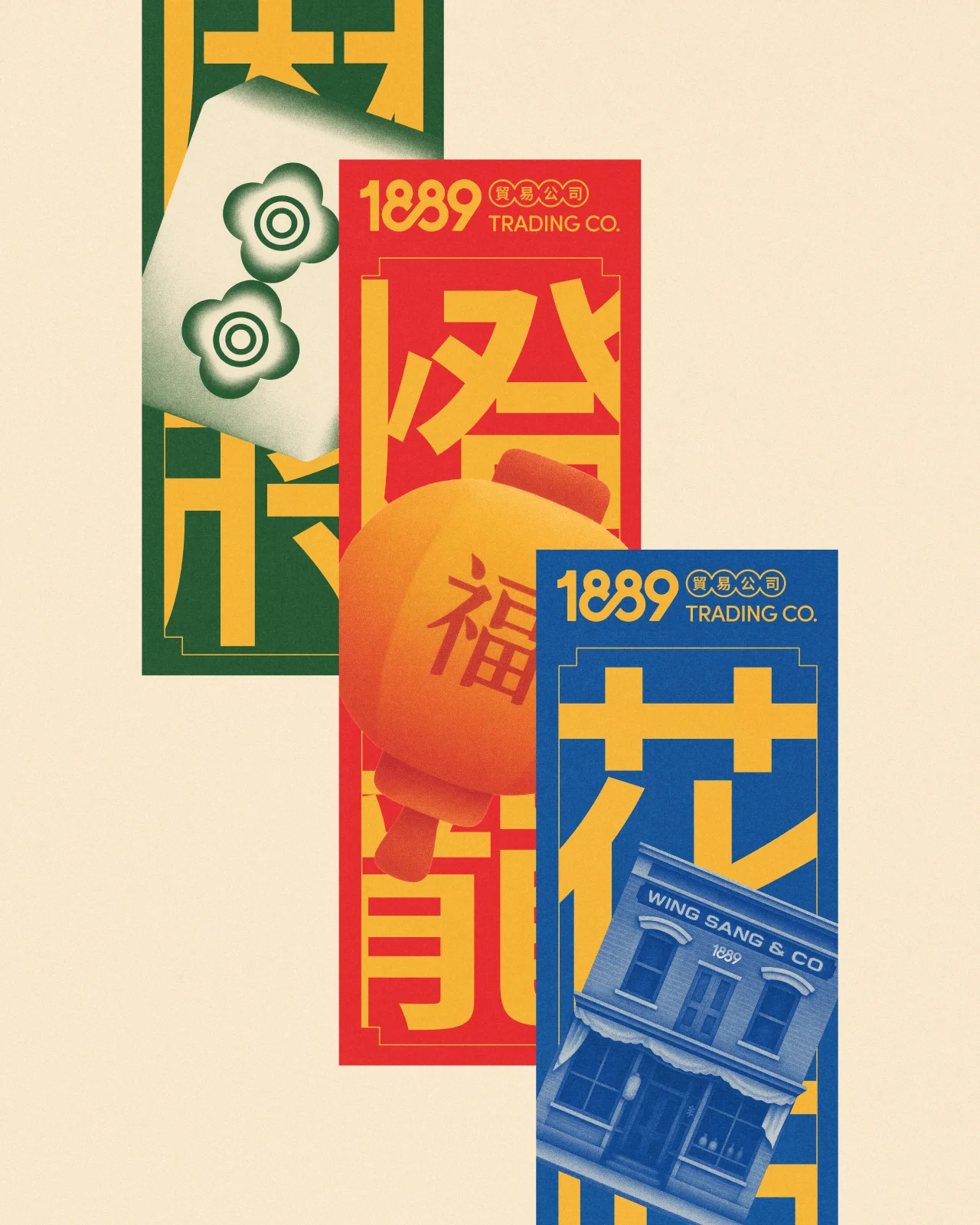
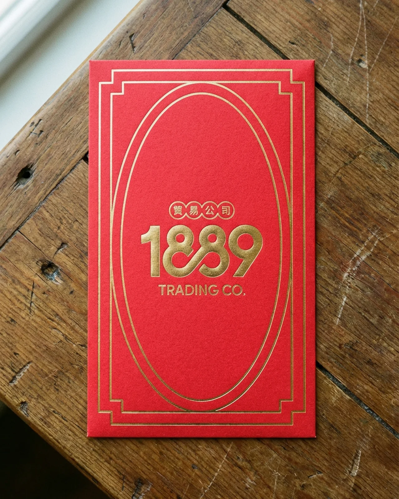
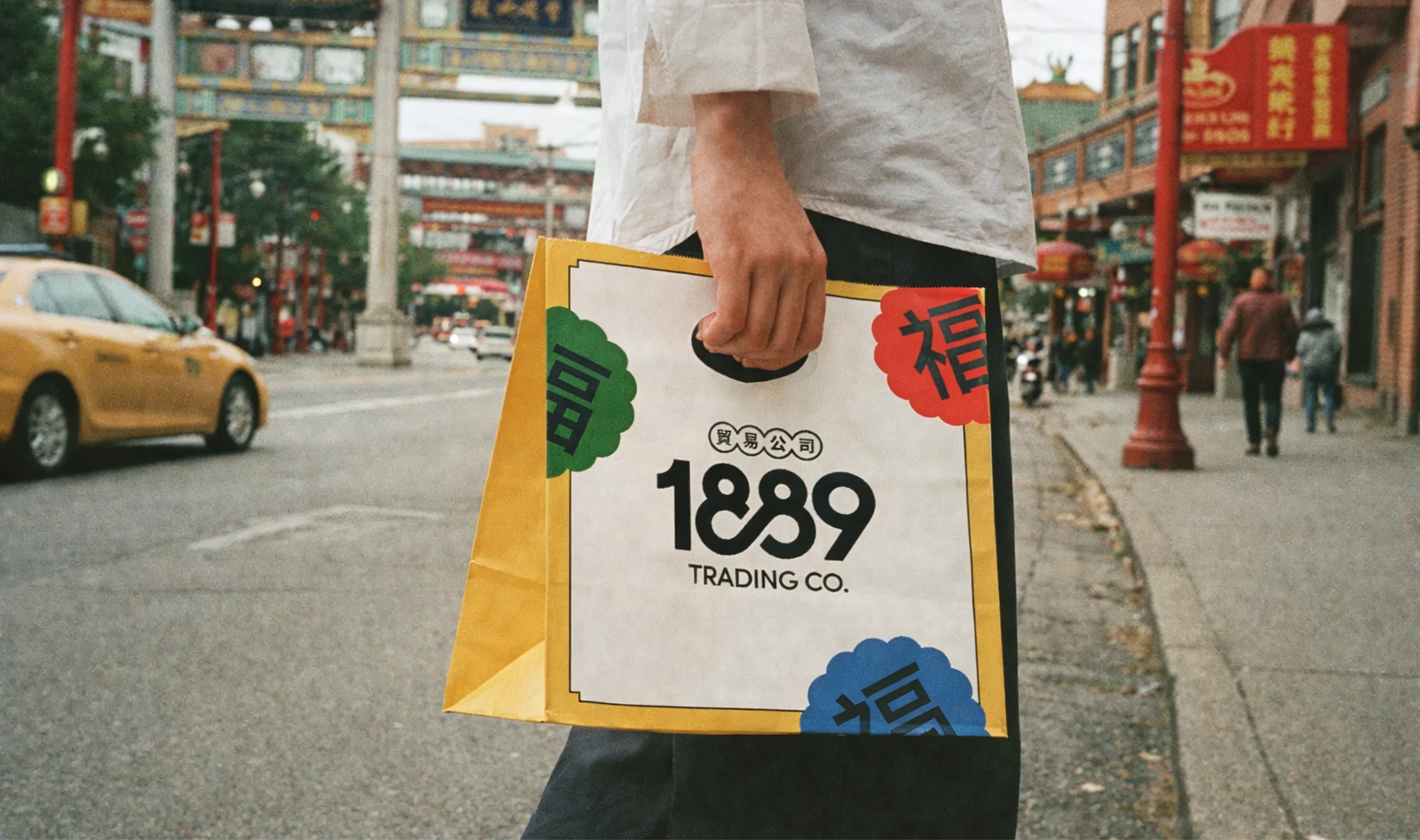
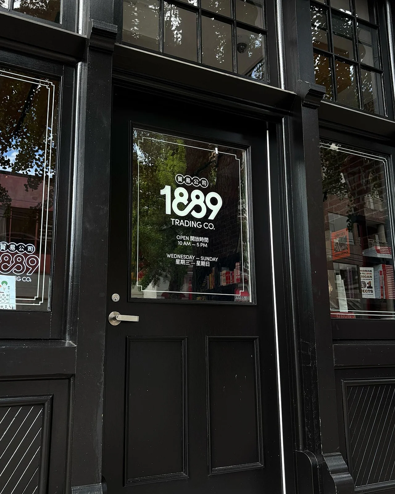
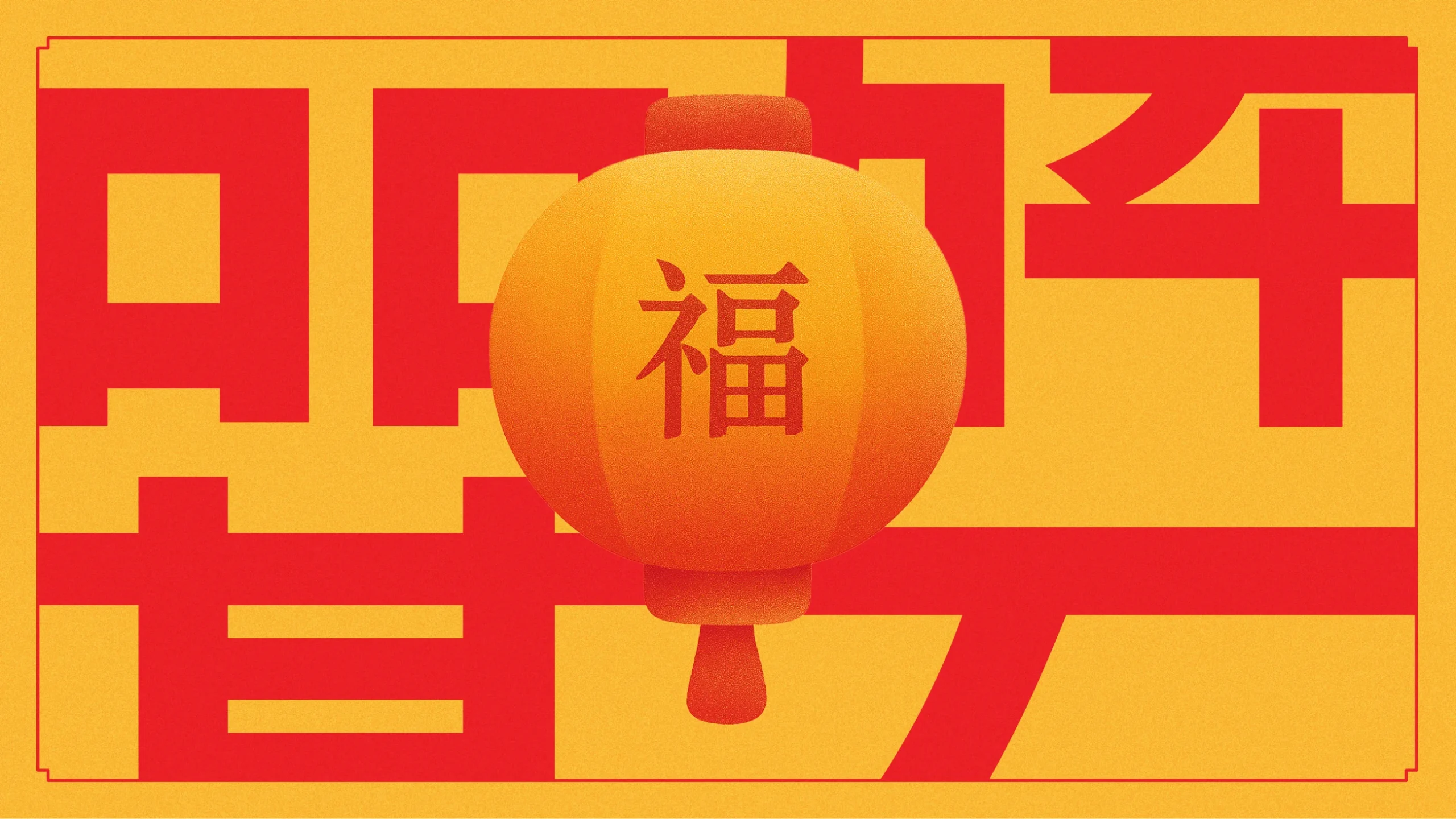
The primary logomark pairs a bold custom numeral lockup with interlinked Chinese character. The two 8s loop together to form an infinity symbol, subtly referencing the cultural significance of the number eight as a marker of prosperity and good fortune while anchoring the identity in both heritage and the present.
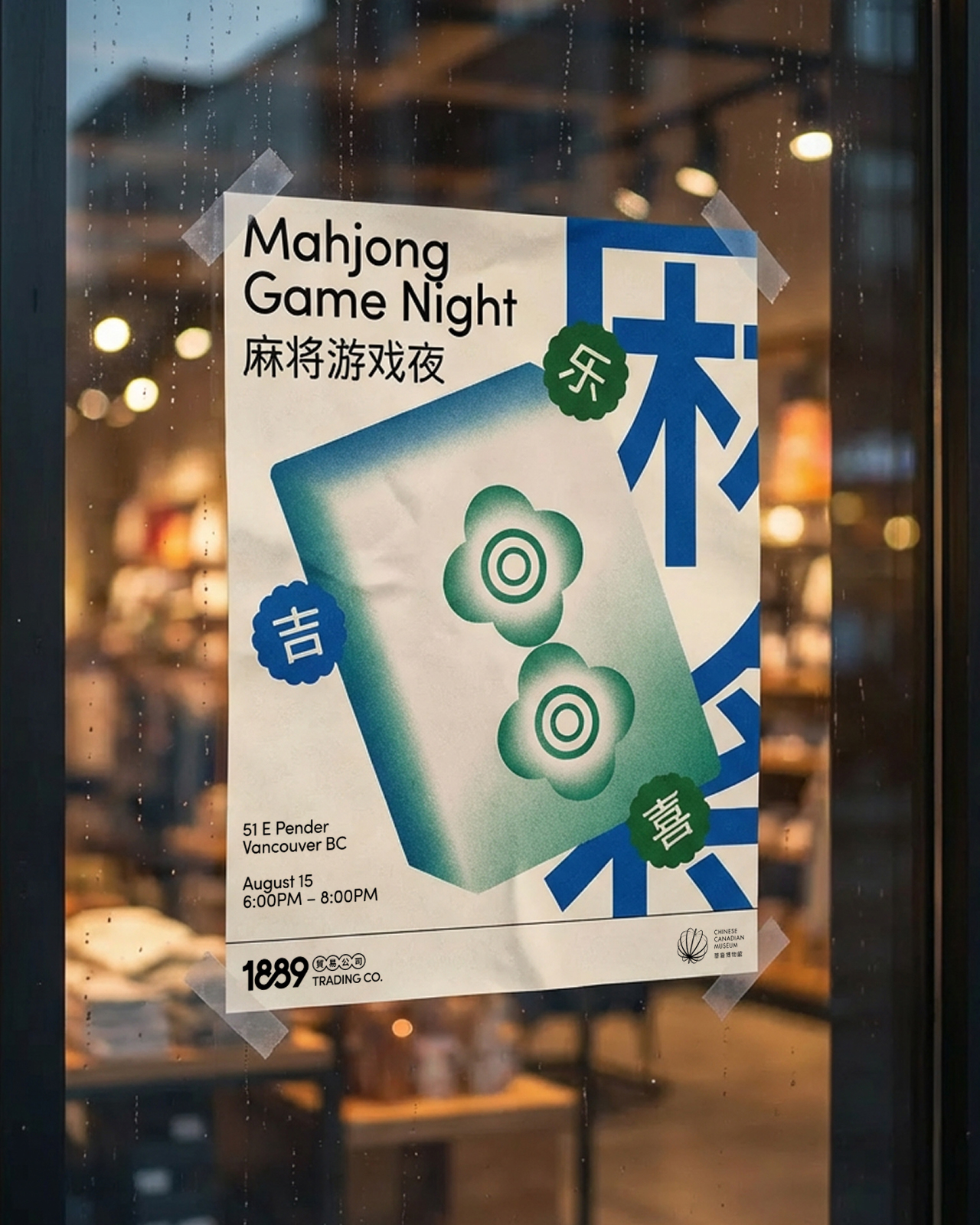
The brand elements go deeper than decoration. Scalloped seal icons featuring characters for luck (吉), blessing (福), prosperity (旺), and joy (乐) signal cultural meaning with warmth rather than kitsch.
A suite of custom illustrations creates a visual shorthand for the brand’s story. Patterns inspired by traditional textiles and architecture add rhythm and depth across the brand itself.
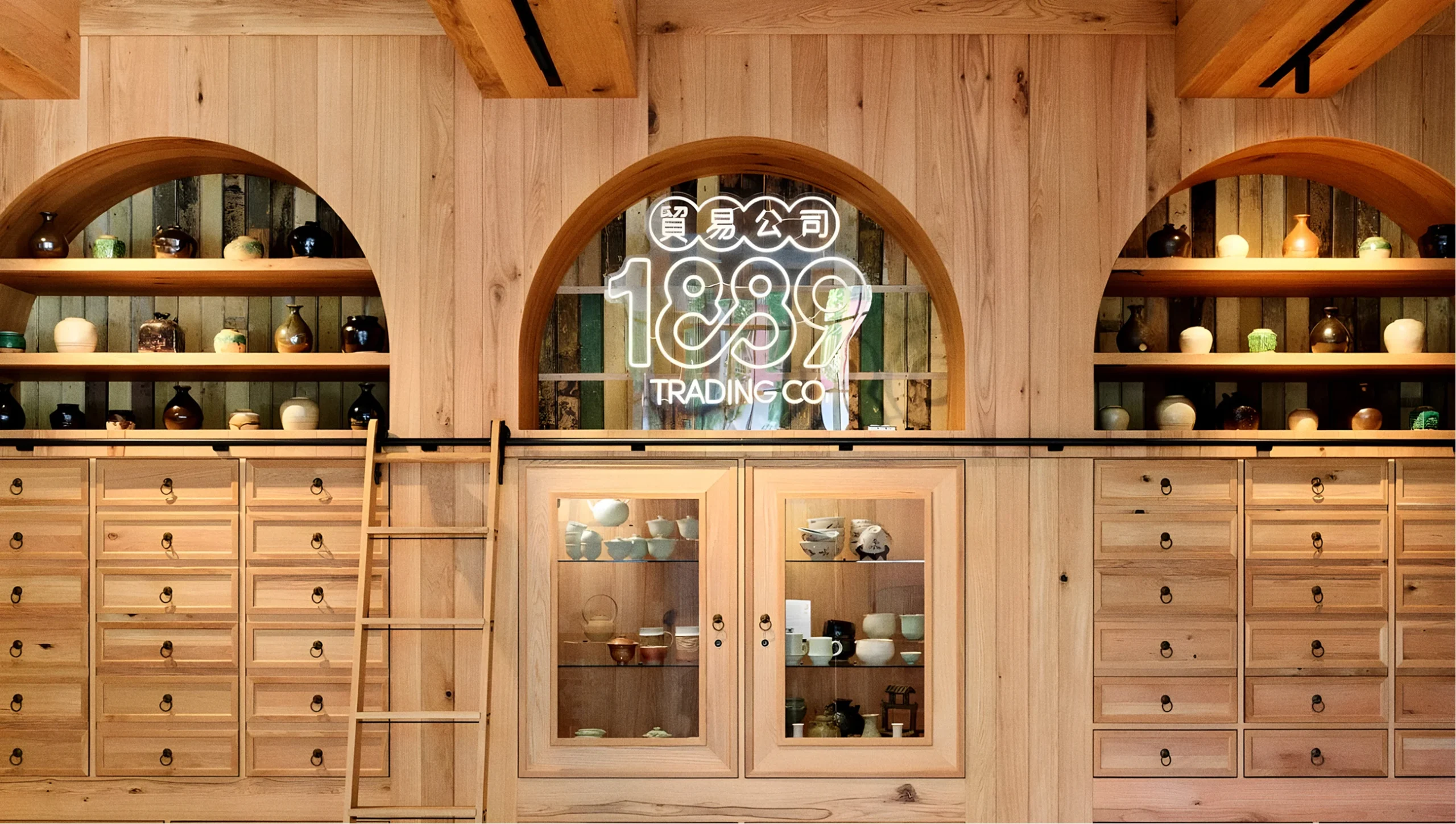
The system extends across event posters, bilingual wayfinding, retail signage, social media templates, packaging, and a comprehensive brand guidelines document built to support the museum team long after launch.