A New Era of ZAK
07/03/2023
If you’re reading this, you’ve probably seen the new ZAK brand out in the wild. Hopefully you like it, and can appreciate how difficult it is to reshape and and rebrand your own business. After 5 years at ZAK, it was time. We’ve been living with a brand identity that was created off the side of our desks a little over 5 years ago (sorry former employers), when ZAK was just an inkling of an idea.
A lot of time has passed, a lot of things have happened, and it was time to launch into the next 5 years of ZAK (and beyond).

While we grew to love our scrappy brand identity, we knew it didn’t really represent who we were anymore. Back then we were just a bunch of kids who wanted to make cool stuff together. We had a lot to learn, and were literally figuring out how to run a studio on a day by day basis.
Today, we’re a creative agency who works with clients both big and small, local and international. Coming out of the pandemic, we had time to reflect on our own brand and it quickly became clear that it was time for a change. We knew it was important that ZAK looks as good as the work that we’re creating.
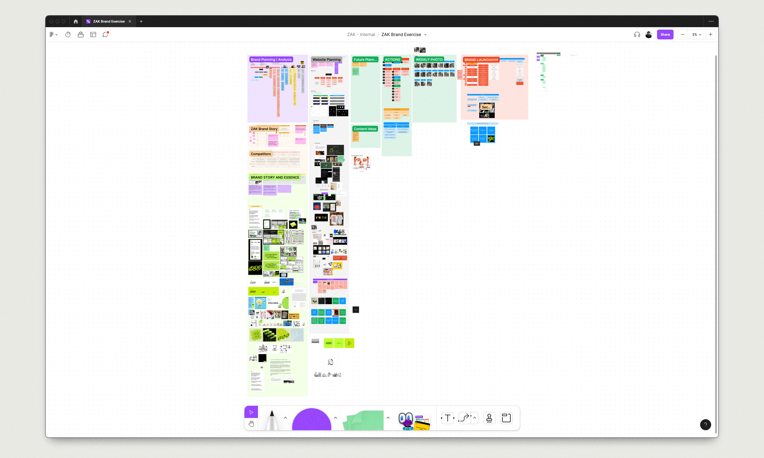
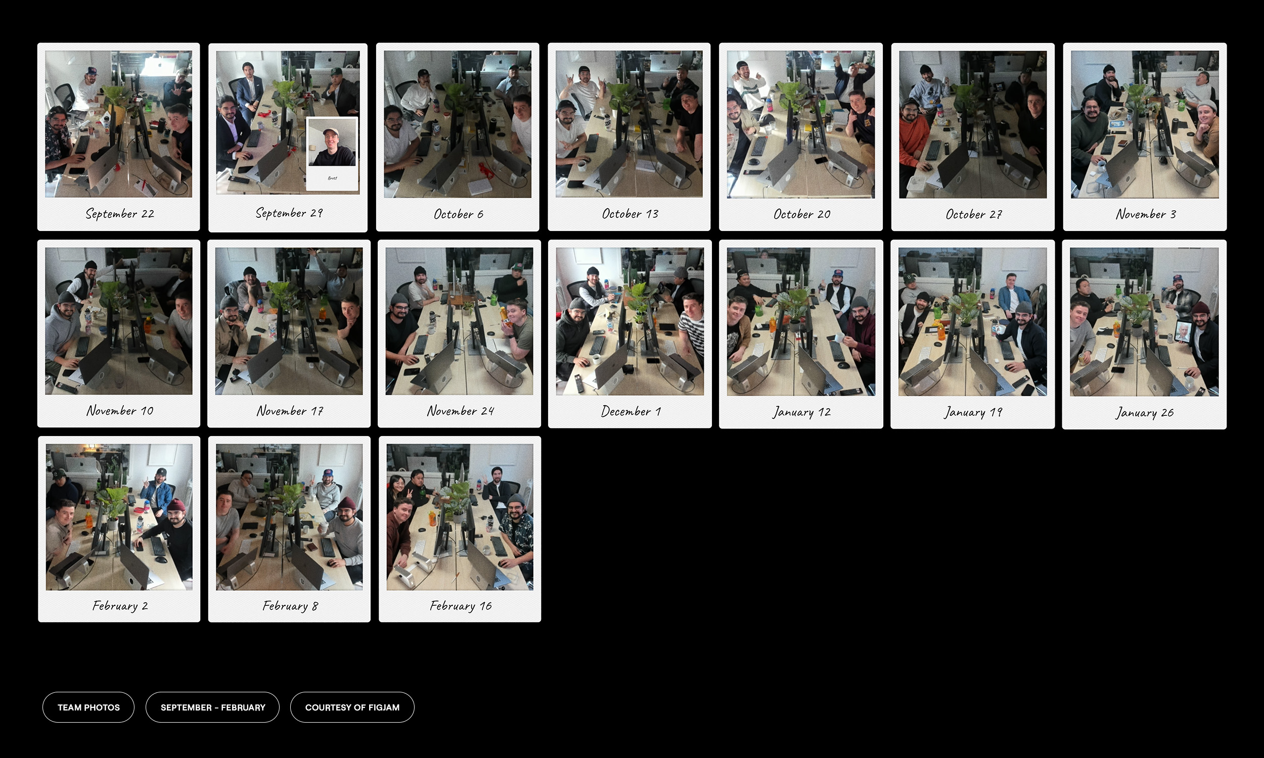
Over the last 6 months or so, we challenged ourselves to work on our own brand the same way we work on any other client project. We carved out a weekly standing meeting, went through discovery and exploration, and explored a whole swath of ideas for the visual identity.
Why We Did It
To put it plainly, we’ve grown up. Over the past 5 years we’ve discovered more about who we are as a company, how we like to work, and who we like to work with. Those 3 things are extremely important to us, and it was vital that we be able to tell that story through the way we talk, but also through our visual language.
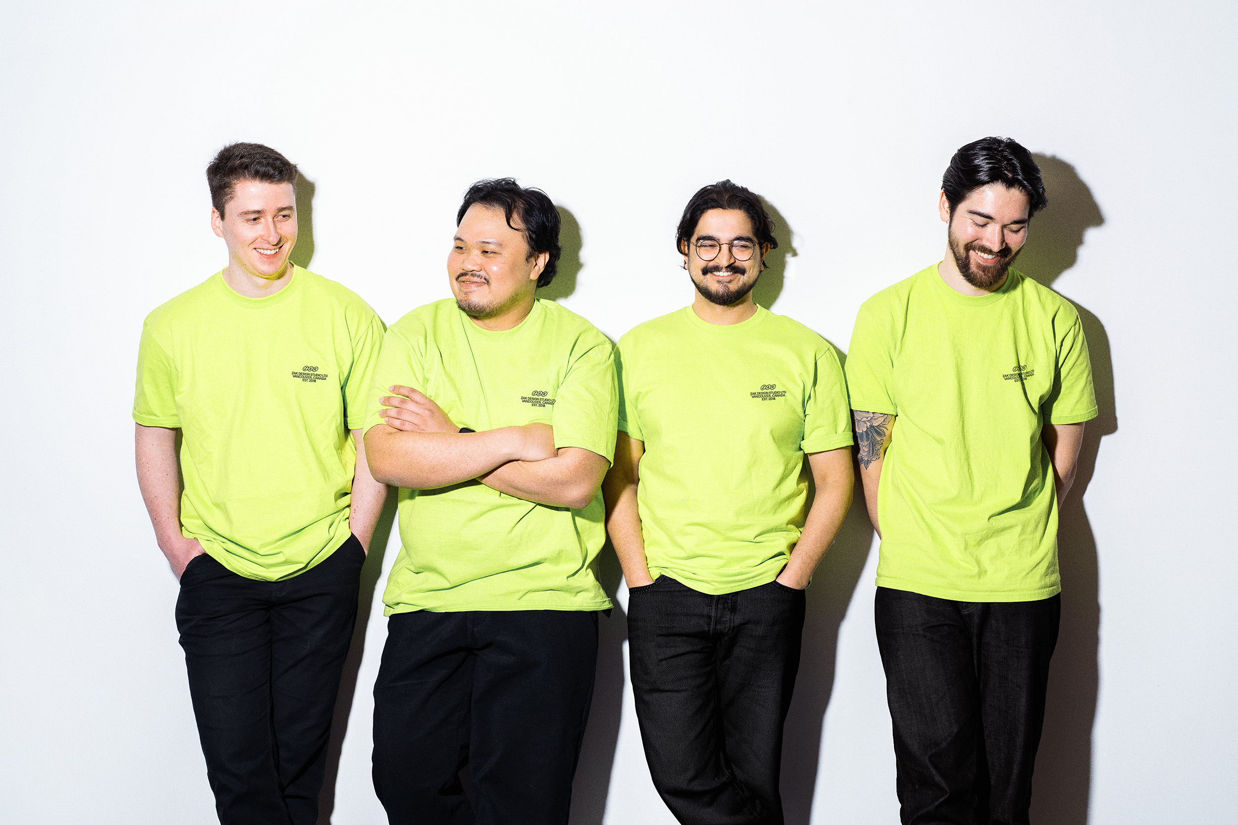
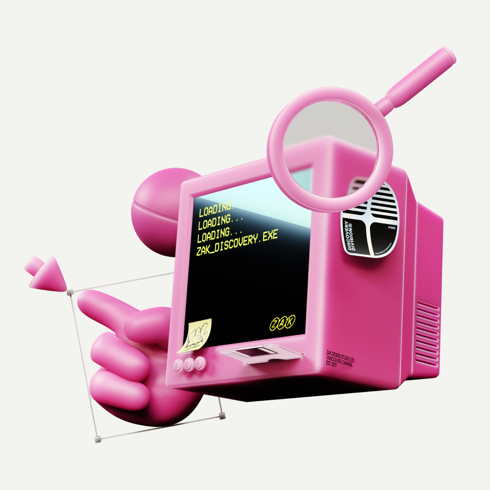
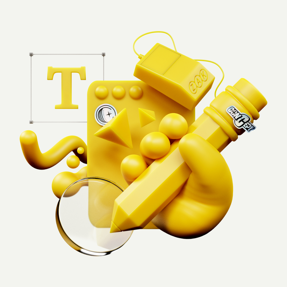
We blended a variety of different mediums to build out our brand’s visual identity, ranging from custom 3D assets to simple hand-drawn illustrations. Everyone at ZAK brings a bunch of different skills to the table, and that’s a big part of what makes us unique. Being able to utilize those skills at the core of the new identity allowed us to imbue a bit of each team member into the DNA of the brand itself.

The ZAK 2.0 Brand
On top of that, as a team we definitely lean into being a colorful, personality driven group. We’ve shifted from a black and white brand identity to one that embraces color often.
For typography, we’re primarily using Roobert by the wonderful Displaay type foundry. It’s a mono-linear geometrical sans-serif, with moments of interest on certain letterforms, such as the “g” and “r”. We love how flexible Roobert is, whether being used for headlines or body copy, it’s just right for us.
We’re using GT Alpina by Grilli Type for headline and special cases. From Grilli Type, “GT Alpina proudly calls itself a workhorse serif, but delights in playing with the very meaning of that concept. It reaches into the grab bag of typographic history to resurrect shapes some may falsely see as too expressive, resulting in a meticulous family melding these distinct shapes with a pragmatic execution.”
Our visual identity is a reflection of who we are. A tight knit team of designers, creatives, and friends that work together to help brands define who they are, at whatever moment of change they may be in.
We’re strapped in and ready for the next 5 years of life at ZAK. Take some time to look through our site, read more about us, view some of our new work, and don’t be afraid to reach out if you think we’d make a great collaborator with your team.